Youth Traffic School
asp Architekten designed a creative and minimal space for the Youth Traffic School in Stuttgart, Germany.
The mobility transition plays a crucial role in the implementation of climate goals in Germany. It is all the more important that the cyclists of tomorrow are well prepared for the future.
Surroundings
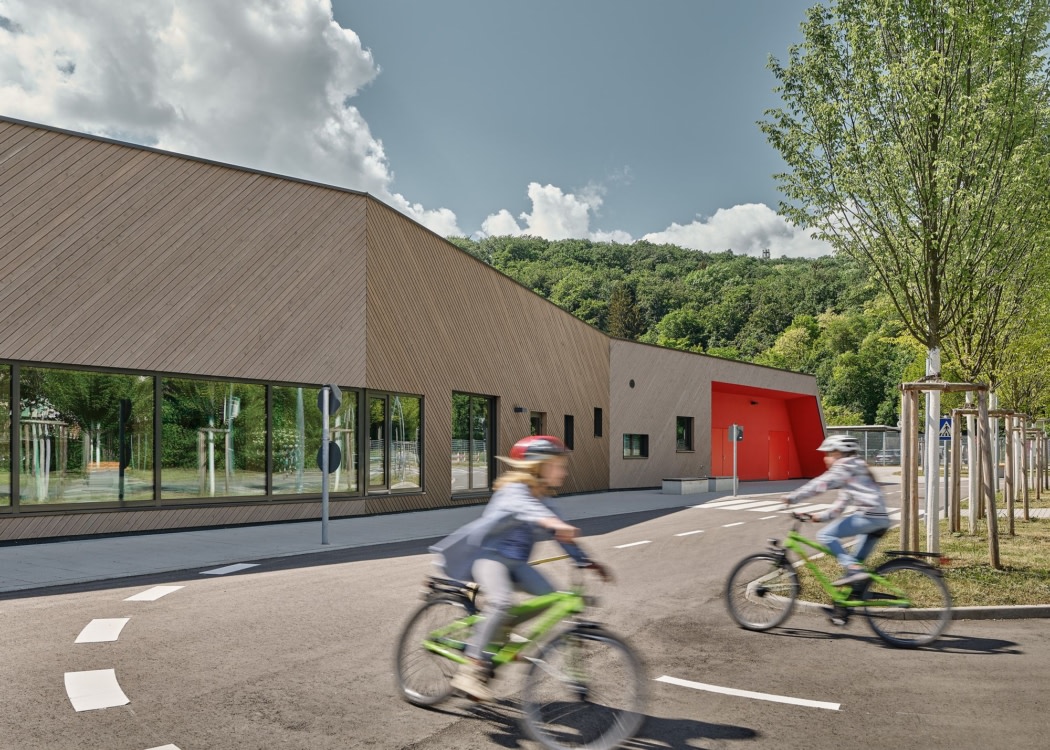
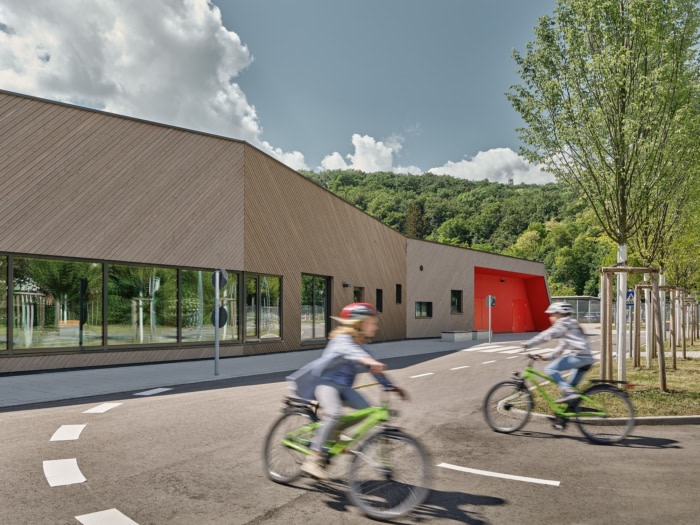
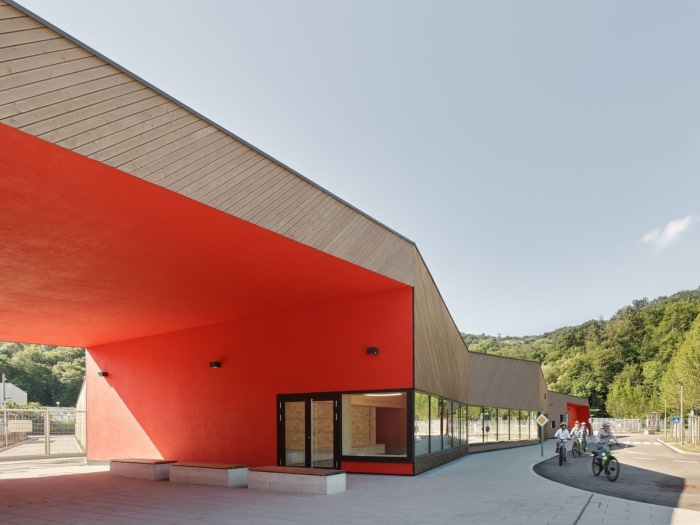
In 1953 the first youth traffic school in Germany was inaugurated on the Diakonissenplatz in Stuttgart. While schools used to fulfill the educational goal of making children responsible road users, it is now the order of the day to plan the buildings themselves, taking sustainability aspects into account. This is what happened in the west of Stuttgart, where the new youth traffic school in Vogelsang has found a new location since September 2021.The one-storey wooden building stretches almost like a part of the landscape over the southern edge of the urban green belt between Zahmenhofstrasse and Unter dem Birkenkopf. The viewer understands immediately: This is about movement. This impression is not only created by the curved shape of the building. It is further enhanced by the design of its shell. For example, the pre-greyed tongue and groove boards made of European larch on the facade were inclined at a 45-degree angle, giving the projections and recesses in the facade additional dynamics. A folded, slightly inclined, green flat roof with water storage underlines this effect and also ensures even more integration into the environment. Only the passage and the “cuts” on the north and south sides of the building stand out in fluorescent red.
Everything under a green roof
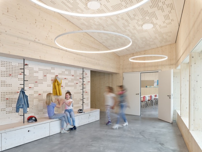
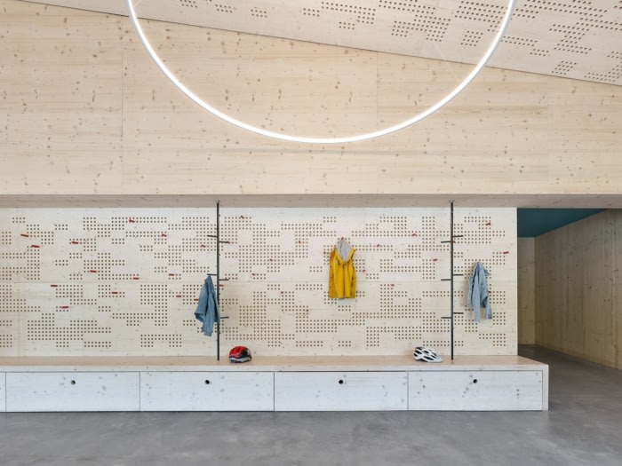
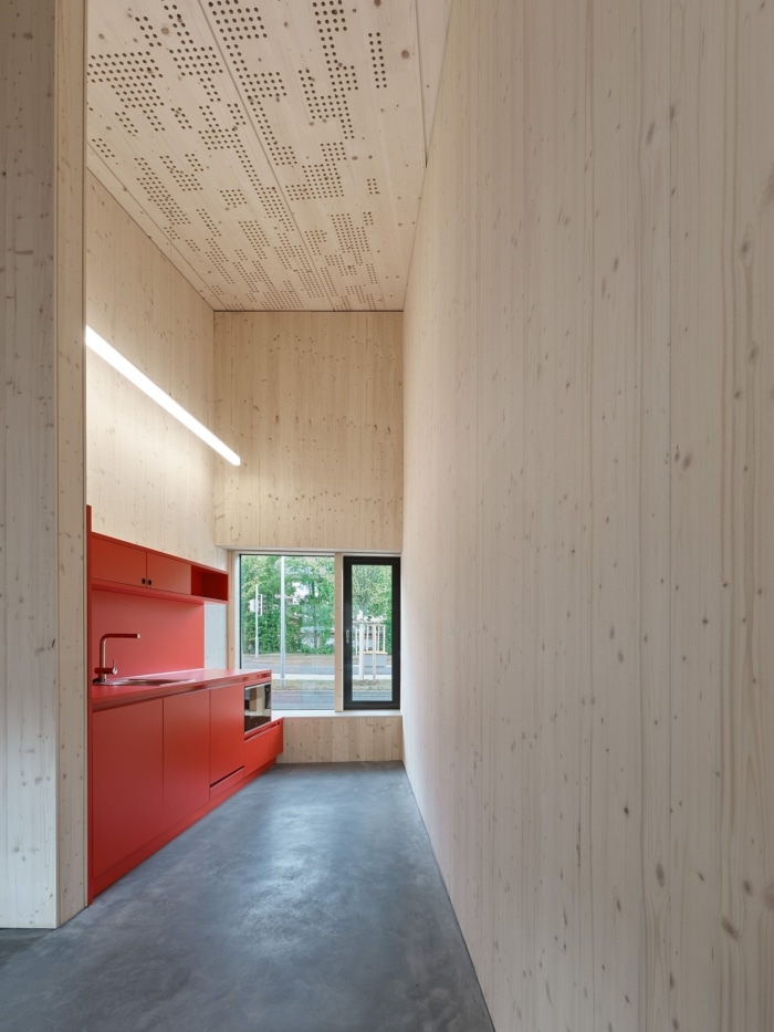
Overall, the youth traffic school with its almost 500 square meters of net room space is divided into four sub-areas. The bright red driveway to the car parking spaces and emergency vehicles is covered and cuts through the building volume. For the children there is a spacious entrance with cloakrooms and seating, as well as a training room and additional sanitary facilities. The police officers stationed on site have their own areas: offices, kitchenettes, changing rooms and a lounge terrace in front of the building on the south-east side create a pleasant working environment. The spatial program is supplemented by operationally relevant facilities: a workshop, a storeroom, a bicycle room, a drying room for wet clothing and a first-aid room complete the concept.Reduced materiality with maximum effect
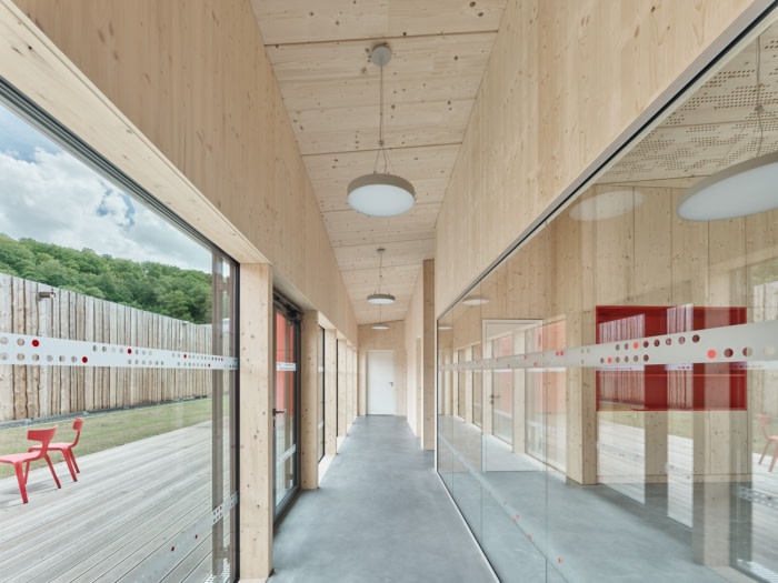
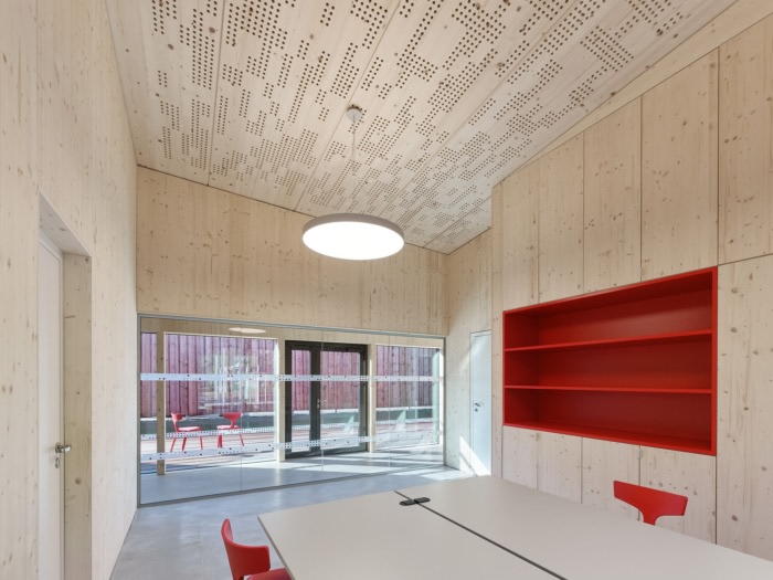
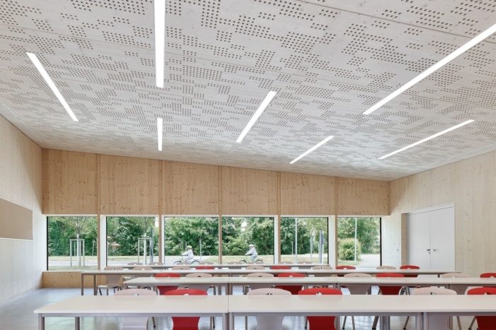
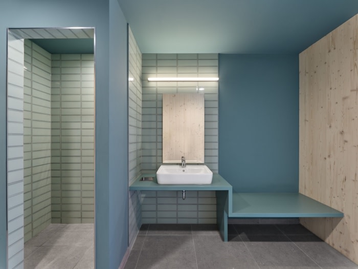
The materiality of the interior is designed to be resource-friendly, like the entire building, without neglecting the aesthetic appeal and room quality. In order to create the maximum effect with few resources, the materials and coloring are consistent, authentic and pure, both inside and out. The insulated reinforced concrete slab, which serves as the basis for the entire wooden construction, was only provided with a hard material screed, sanded and oiled. All walls were paneled with panels of semi-matt oiled spruce. The hollow box ceilings, which are also made of semi-matt oiled spruce, have a perforated pattern to improve the room acoustics. At the same time, the perforation in some walls serves as a holder for wooden pencils, which the children can use as coat hooks, for example, based on a playful plug-in principle. In the interior, too, fixtures and furnishings are in bright red as a counterpoint to the reduced materiality of concrete and wood.In front of the building on the northwest side is the varied, spacious bike course. Different surfaces such as sand, gravel or cobblestones can be “ridden on”, there is a railway track that can be crossed and there is also signage that promotes the children’s ability to ride a bike and find their way around at the same time.
Design: asp Architekten
Photography: Zooey Braun





Now editing content for LinkedIn.