Sidney Lanier High School
LPA Design Studios blended both past, present, and future when redesigning Sidney Lanier High School in San Antonio, Texas.
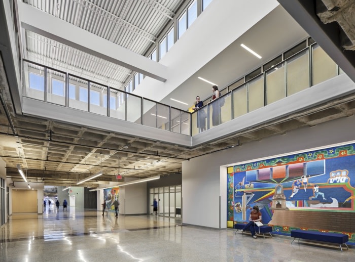
First opened in 1915, Sidney Lanier High School is a community fixture in the cultural heart of San Antonio’s historic West Side. Mural culture in San Antonio started at and around the school, and over decades much of the interior was painted with imagery that reflected the traditions and artistic talent of the community.
When LPA began to work with San Antonio Independent School District to plan the school’s future, preserving the rich cultural history was an important part of the discussion. Designers were aware of the responsibility to respect the past while providing educators and students the modern facility they needed to succeed.
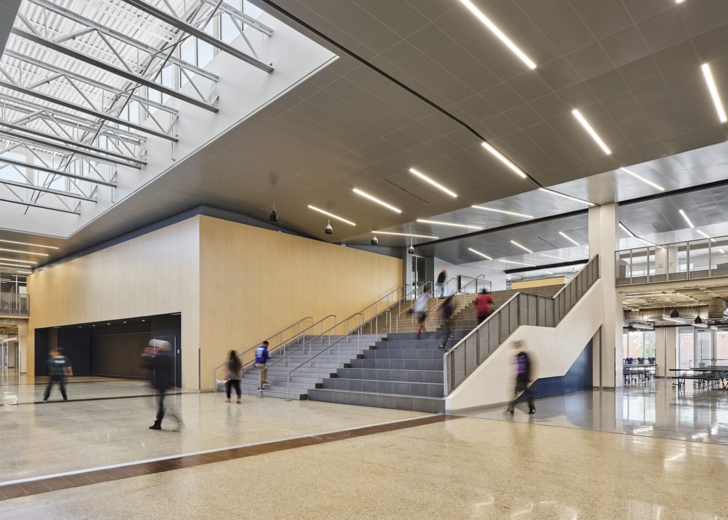
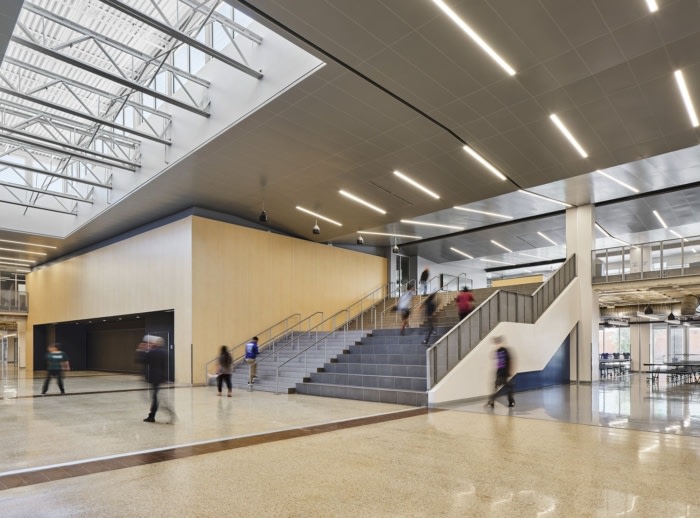
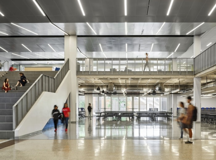
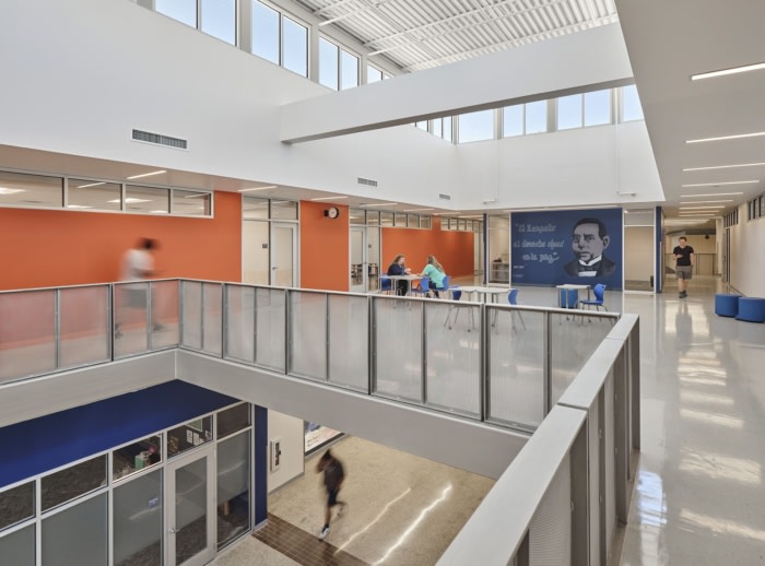
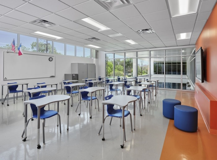
The century-old, windowless, brick-clad building spanning the length of two football fields was completely reimagined. A central atrium space was created, adding interior gathering spaces and promenades and opening up the entrance, crafting a true front door for this neighborhood landmark. Learning areas were filled with natural light, and different zones were created to support different curriculums. To honor the school’s mural culture, designers reintroduced 10 key artworks, established a digital museum, and reserved wall space for future murals.
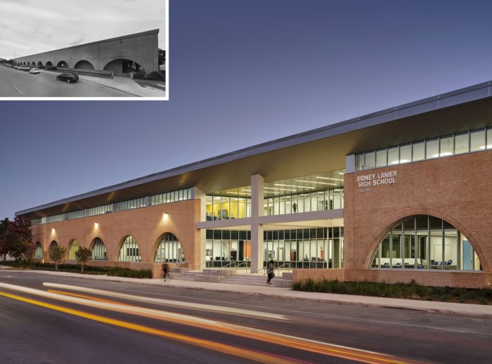
The design challenge and opportunity lay within the school’s fortress-like appearance and boxy design. Heavy walls, exterior brick arches and windowless classrooms meant the school could feel inaccessible, dark and closed off from the outside. The interior layout wasn’t easy to follow, leaving many disoriented. Students were cramped in small classrooms, with few meeting spaces outside of classrooms.
But the building was structurally sound, and flexible enough for a strategic redesign. Saving the bones of the building would cut costs and reduce the carbon impact.
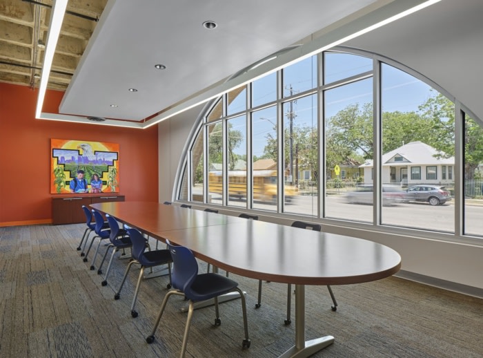
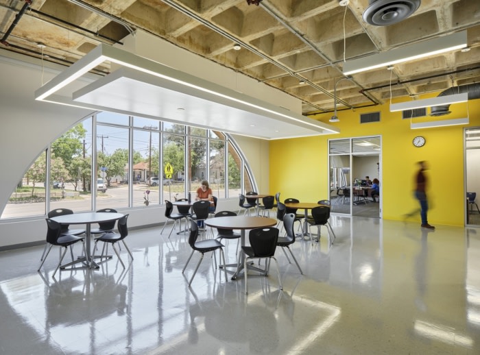
To make it work, designers sliced off the roof and top section of the walls to add clerestory windows, while inserting a central entry nave to create an atrium and open entryway. Shared central spaces with stadium seating and light-filled corridors replaced the dim hallways and confusing wayfinding. Filling in the brick arches with windows illuminated the ground floor and opened the facility to the surrounding streets.
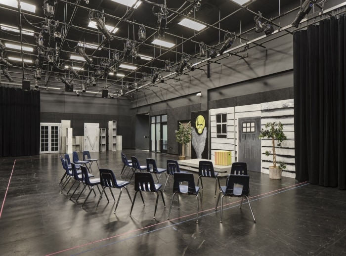
As a space and school, the new Lanier is more flexible. The purity of the boxy building was turned into an advantage, making it easier to create a system of rooms that could be shifted and combined to fit evolving needs and new classes. More-adjustable spaces for collaboration and socialization make layouts and classrooms more fluid, opening up the school, engaging different learning styles and allowing for different curriculums. Principal Ortiz said it was like plugging the school into 21st-century learning platforms.
The entire facility was future proofed; technology throughout the facility underwent a significant upgrade, and major systems, including the roof, were replaced. Simultaneous enhancement to energy and HVAC systems will cut the school’s energy bill by 60%.
The project was carefully phased so that classes could continue uninterrupted while work was completed.
Design: LPA Design Studios
Contractor: Gilbane
Photography: Matthew Niemann








Now editing content for LinkedIn.