Western Michigan University – Student Center
The new Student Center at Western Michigan University, designed by CannonDesign, prioritizes inclusivity through a student-centered layout, Native American cultural elements, and nature-inspired features.
CannonDesign introduces the new Student Center at Western Michigan University (WMU), a beacon of inclusion. Located on lands historically occupied by Ojibwe, Odawa, and Bodewadmi nations, the building is designed to be a student-centered gathering place that champions belonging and honors the roots of Native American heritage embedded throughout the site.
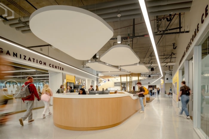
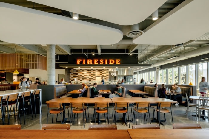
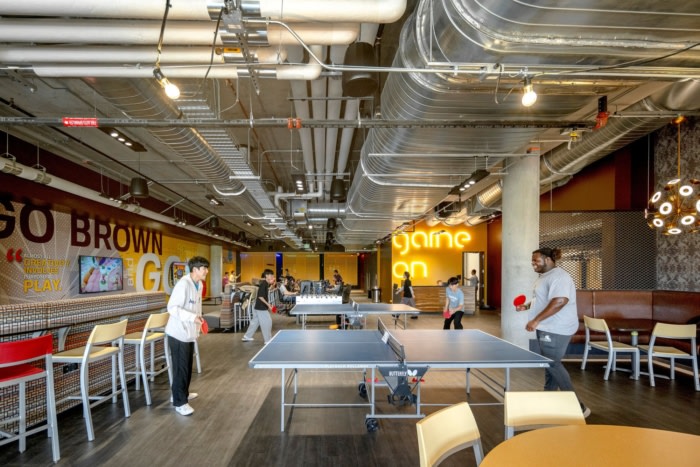
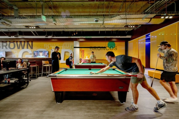
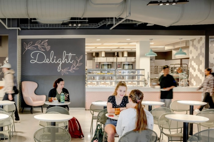
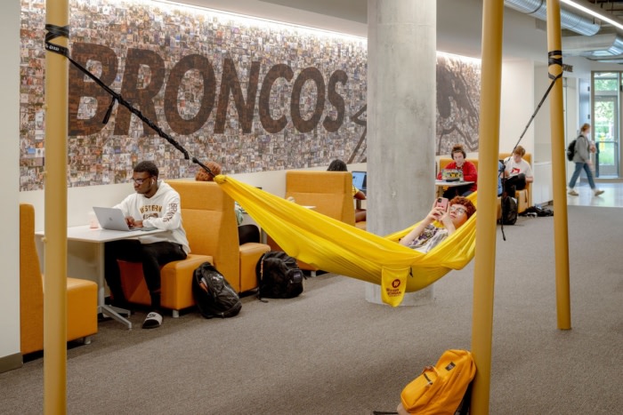
Replacing the Bernhard Center, the new vibrant space is designed to foster connection, community, and collaboration for all students. The three-level building features gathering and lounge spaces, dining options, the campus bookstore, an anticipated on-campus brewpub, retail locations such as FedEx and Starbucks, and more.
Here, inclusion goes beyond small design elements, as the entire building and its design is a testament to the university’s commitment to fostering belonging and inclusivity. This project not only serves as a model for creating an authentic and inviting student center, but also demonstrates the opportunities that exist for prioritizing inclusivity in all aspects of campus life.
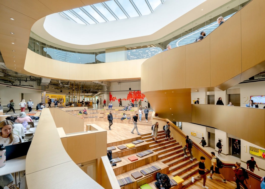
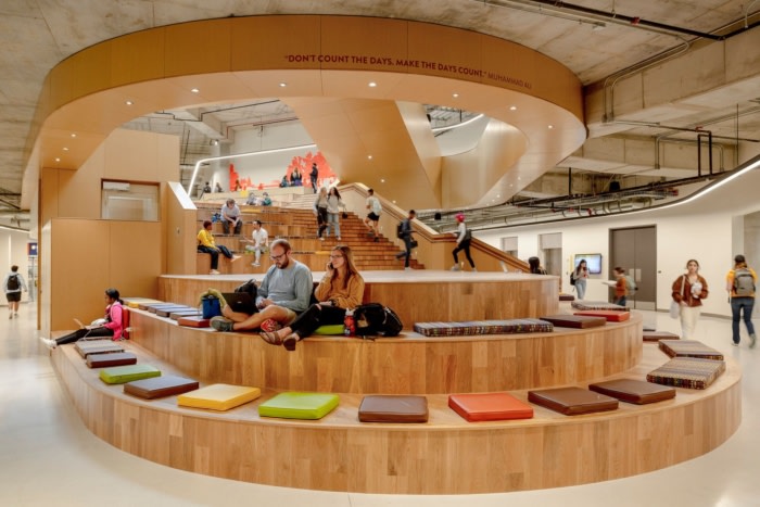
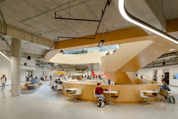
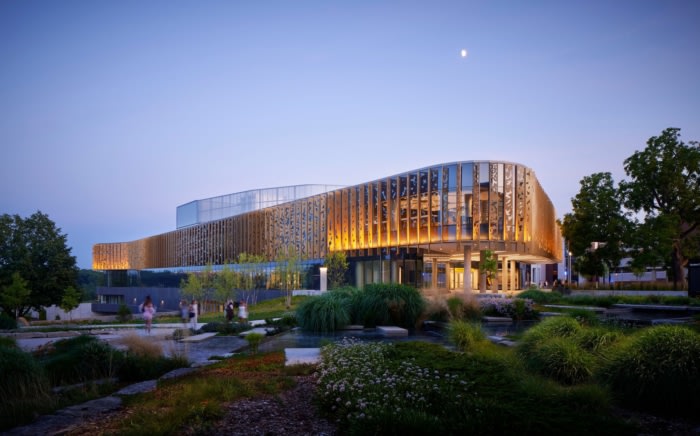
With input from thousands of students, the building layout was developed from the concept of “C3” spaces: collide, collaborate, and conspire. The idea was for the flow and spacing of the floorplan to facilitate interstitial opportunities for students to connect with each other throughout the building. It aims to facilitate the types of engagement students identified as a driver for an atmosphere of belonging. Student feedback also influenced a design that incorporates elements of Native American culture, such as the idea of the sitting circle. Rather than the straight walls and rectangular spaces that are customary in traditional architecture, the building features mostly curved walls and circular rooms.
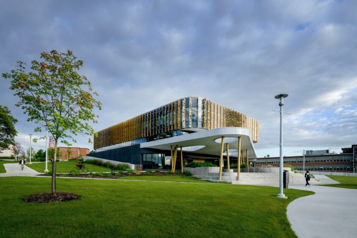
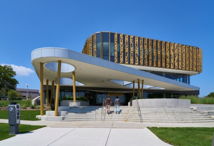
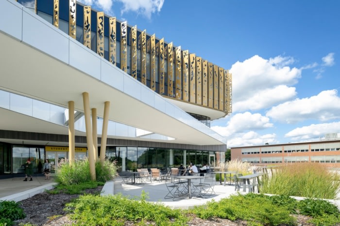
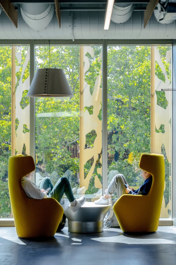
The celebration of nature was also a theme that served as a conceptual cornerstone of the building, incorporating inspiration from local natural elements. The ground floor rises out of the site and is clad in stone, which mirrors the bedrock of the region, Coldwater Shale. The middle level is wrapped in glass and features exposed columns, mimicking the experience of walking through a Michigan forest. The upper level features gold fins that fan out around the façade, providing sun protection and reflecting cutouts that mimic a tree canopy shadow onto the exterior glass and into the interior spaces.
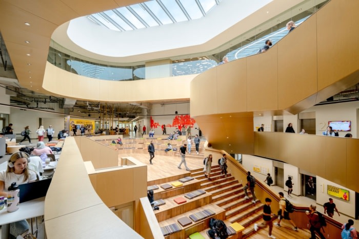
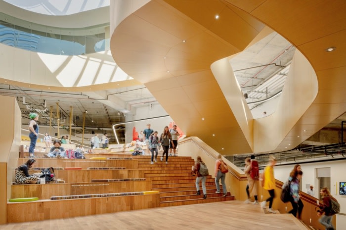
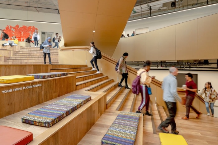
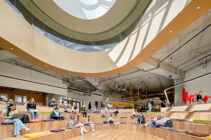
The iconic central atrium, lined with wood and lit above by skylights, is known as the “Heart,” invoking the forests of Michigan that include plenty of cedar trees. Among many of its uses, the Heart is a place where affinity groups meet, featuring sitting areas, performance spaces, and flexible spaces – all just steps away from the constant beam of natural light that flows from the roof all the way to the ground floor.
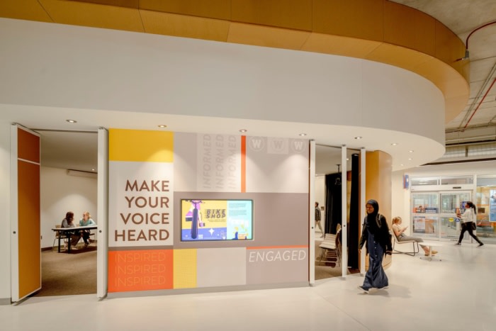
The new student center delivers a truly student-centered environment curated to help all students to feel recognized, to make connections, and to explore. All at once, the building simultaneously nurtures community and individuality by inspiring students to discover and share their voices, while learning about those whose identities are different than their own.
Design: CannonDesign
Design Team: Charles Smith, Brett Lawrence, Carrie Parker, Robert Benson, Renee Wallace, Paul Terzino, Chris Sligh
Associate Architect: Hobbs + Black Architects
Photography: Christopher Barrett, Laura Peters









Now editing content for LinkedIn.