Les 4 Saisons School, Bruguières
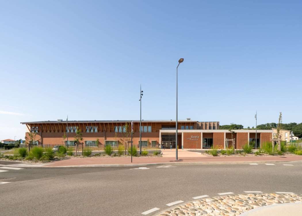
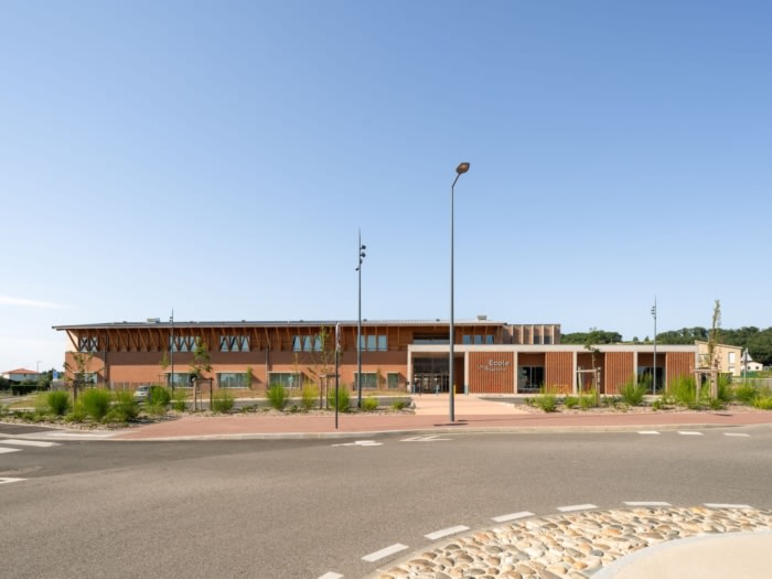
The school Les 4 Seasons by HARTER architectes associés in Bruguières, France, features a design that integrates with the site’s topography, uses local plant species, and emphasizes a clear circulation axis.
A developing site
Located at the entrance into the Briqueterie estate in Bruguières, the project is sited in a heterogenous, sparsely developed area (detached and semi-detached houses, former workshops and bits of agricultural land). Within this developing landscape, the school Les 4 Seasons sits at the intersection of Rue de la Briqueterie and Avenue Gamouna.In dialogue with existing structures
The school echoes the iconic Briqueterie building, reflecting its north–south orientation and thereby establishing it as an important element within the neighbourhood.The school adapts to the general topography of the site (around 3 metres elevation gain) by means of a succession of ramps and terraces from the new roundabout to the back of the site.
The trees and shrubs that have been planted are local species that suit the climate and require little care (ash, service trees, elms and oaks).
The backbone and its ‘ribs’
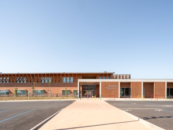
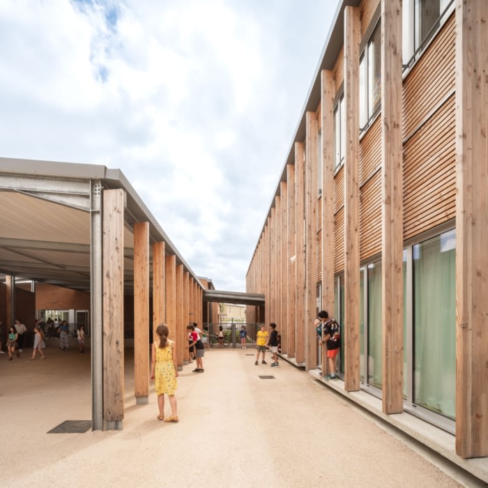
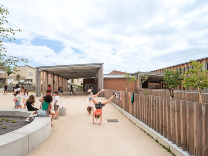
A broad walkway in red concrete leads from the mineral forecourt at the entrance of the site, constituting a major structural element within the project.It runs through the hall and between the canteen building and covered play areas, out to the northern extremity of the site.
Acting as the ‘backbone’ from which the various elements of the project stem, this axis organises circulation so as to make the overall layout clearly understandable and easy to navigate.
The project aims for an architecture that is simple, systemic and adapted to the site. Large, slender volumes are offset to let in light and make way for planting.
Main building
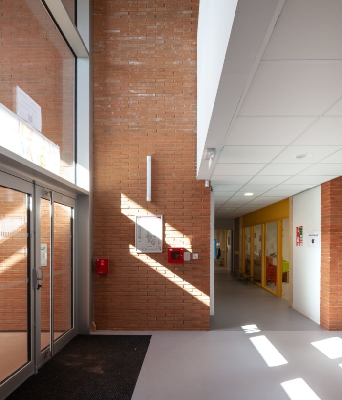
Designed as an extension of public space within the school premises, the reception hall provides a generous, full-width space off which are located the administrative offices, thereby visible from the entrance. The classrooms and quiet rooms (dormitory, library) are placed to the north, benefitting from soft, constant light and avoiding overheating in summer. Workshops and service areas are located on the south side. Used less during the day, they benefit from morning light, sheltered during the hottest hours of the day by concrete projections and roof overhangs.All areas are accessed via a central corridor; equipped with rooflights it enables very agreeable natural ventilation. The main staircase and lift give directly onto the hall and provide access to the upper floor. A secondary staircase located on the other side of the main building ensures greater fluidity of movement.
Secondary building
The dining rooms benefit from large windows. For the primary school dining these windows open to the north onto a wooded mound, and for the nursery dining they open to the south, overlooking a shadey area.Outdoor spaces
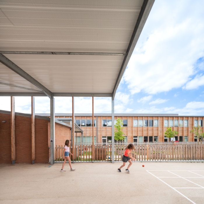
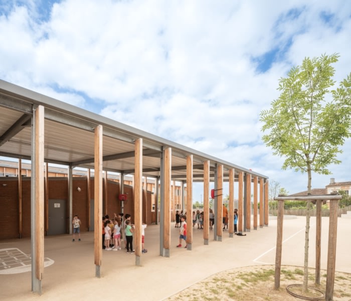
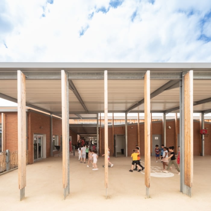
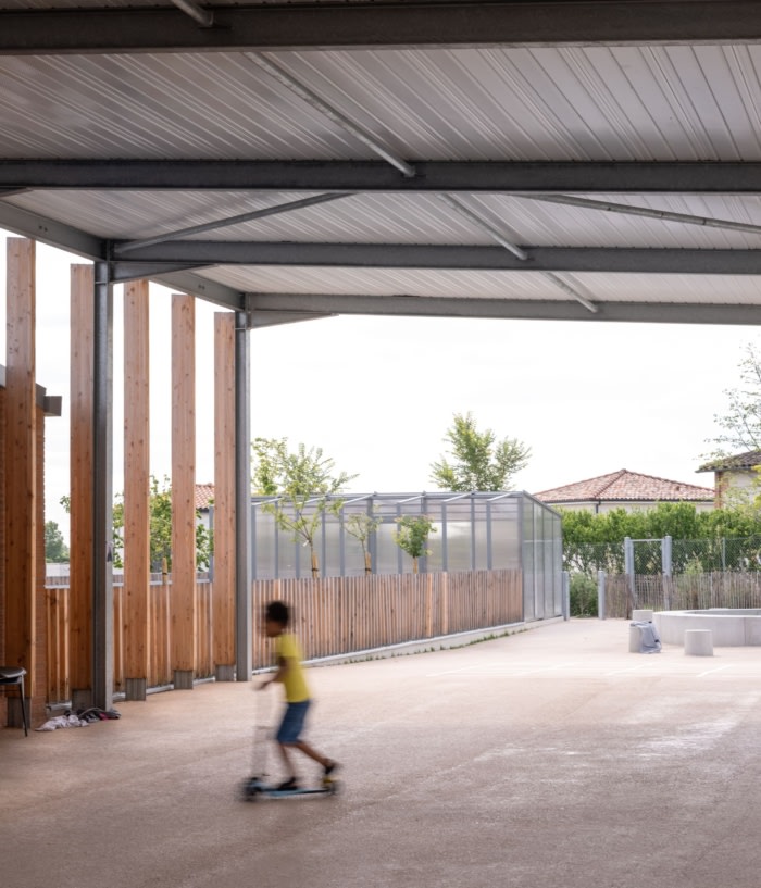
The playgrounds are punctuated with trees providing shade and cool. Two large covered spaces provide shelter from sun and inclement weather.Flexibility of use
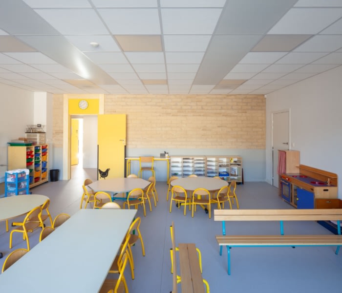
The nursery school classrooms all open directly onto the playground, providing a direct relationship with the outside and ease of movement for the children, particularly during after-school activities.At the interface between the nursery school and primary school playgrounds, the kitchen garden/ orchard area contains a greenhouse, allowing the children to learn about plants throughout the seasons.
At the entrance, between the school and the forecourt, a multi-purpose hall is conveniently located for access from both inside and outside the school, allowing for independent use and providing Bruguières with a venue for public events.
Signage, a collaborative project
Throughout the design and site phases, the client and users collaborated on the project with discussions on uses, choice of materials and colours. Several workshops and site visits served to refine these subjects.The name of the school, for example, was voted by the town’s children – Les 4 Saisons, the Four Seasons.
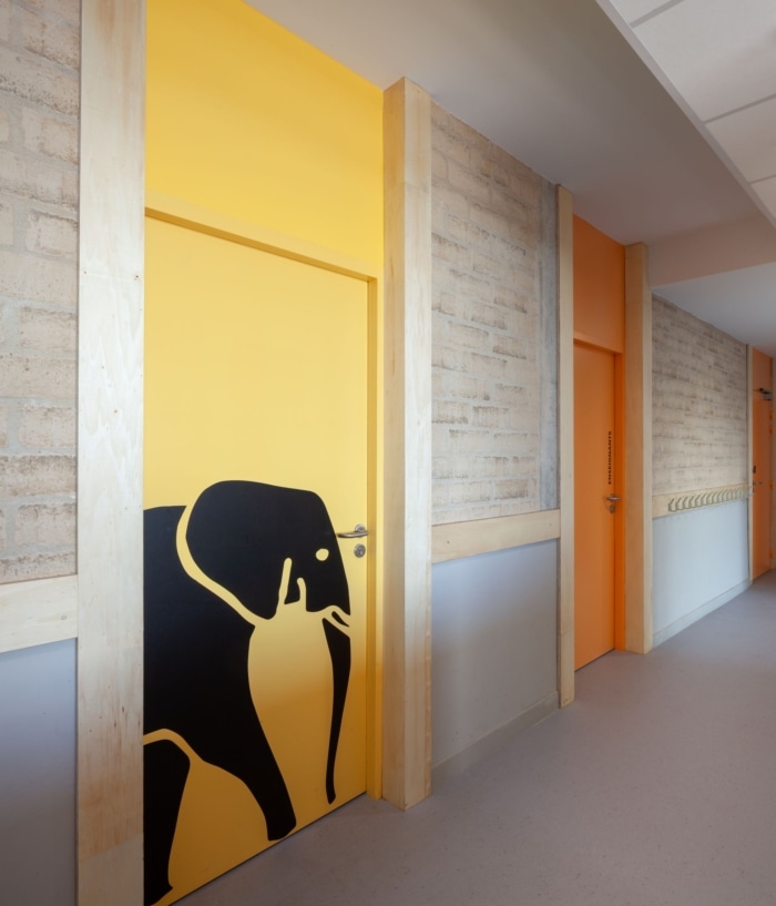
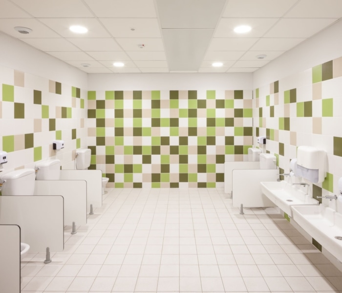
Following this decision, four colours were selected, each referering to room uses.
Animals and insects (more or less complex according to age) were also drawn and displayed on doors so that the children could easily identify and appropriate their own classroom.
Design: HARTER architectes associés
Photography: Frédérique Félix Faure







Now editing content for LinkedIn.