Heilbronn City Library
DIA Dittel Architekten redesigned the Heilbronn City Library with a focus on modern, functional zoning, hybrid usage possibilities, and a vibrant, inviting atmosphere to foster interaction and learning.
DIA Dittel Architekten is responsible for the high-quality refurbishment and redesign of the Heilbronn City Library in the lively cultural and shopping centre Theaterforum K3. After a two-year restructuring phase, the library has been given a new lease of life and provides a forum for communication and encounters with modern, contemporary architecture.
The Heilbronn City Library is an important part of the lively cultural and shopping centre Theaterforum K3, a building complex dating back to 2001 with a cinema, theatre, university and other institutions and companies. After around two years of restructuring and refurbishment, a distinctive venue has been created that provides space for communication, interaction and intergenerational learning.
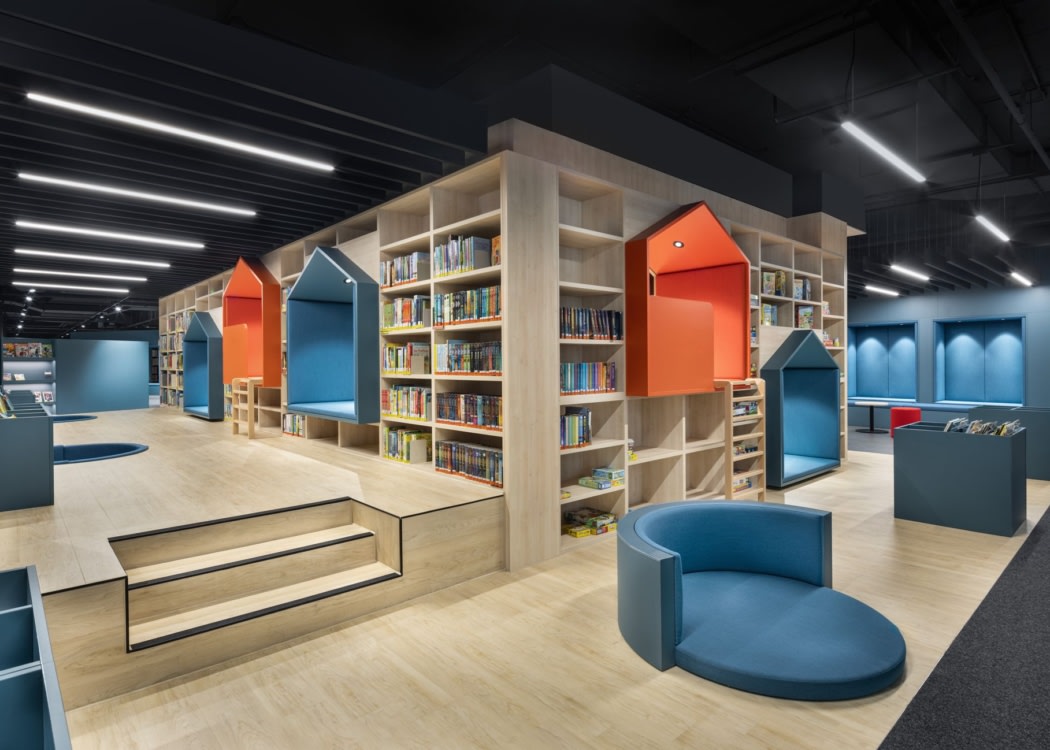
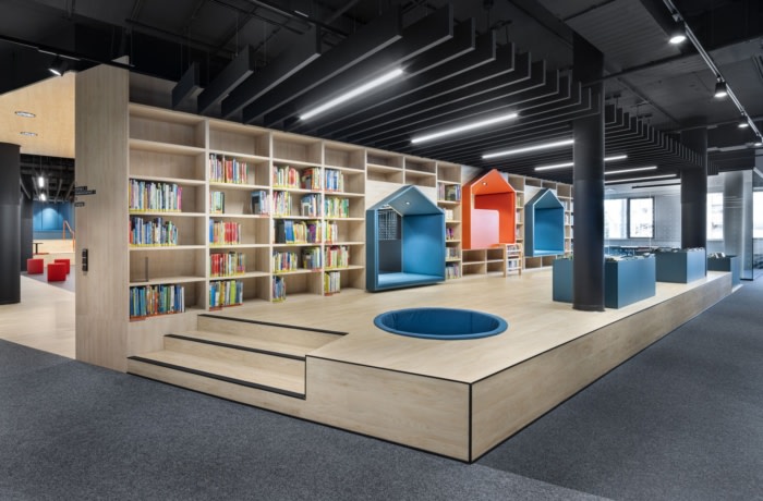
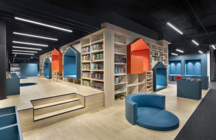
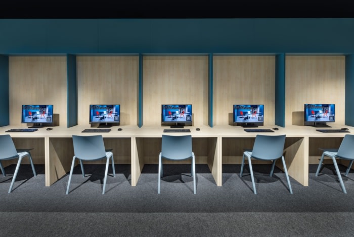
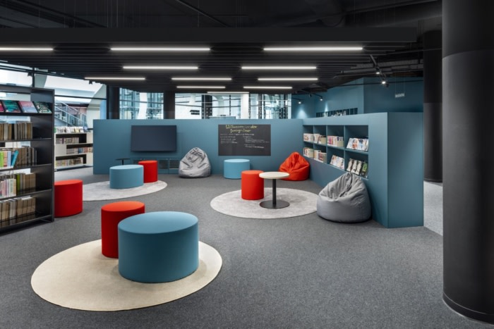
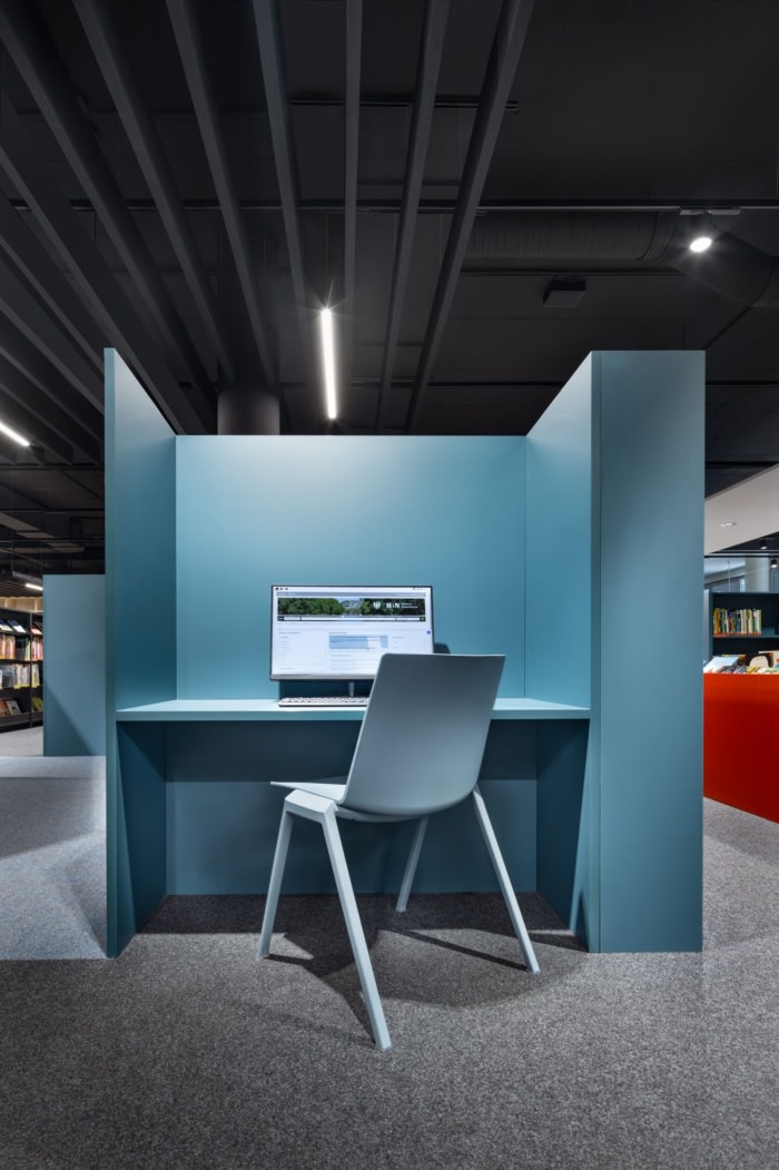
On around 3,500 square metres spread over two floors, DIA has created retreats, communal zones, areas for multimedia learning and events, as well as office and meeting rooms. An integrated children’s and youth area with an online programme, games and magazines is an exciting space for the whole family – and bridges digital and analogue worlds. The library fulfils an important social and cultural function by providing a platform for interaction and networking for the wider public.
When planning the project, it was important to DIA to involve all project participants in the design process from the outset. This collaborative partnership and the use of BIM planning tools ultimately led to a needs-orientated design that ensures long-term usage.
New zoning: Flexible spatial configurations
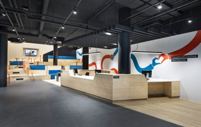
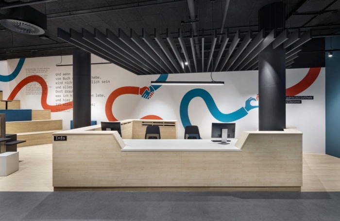
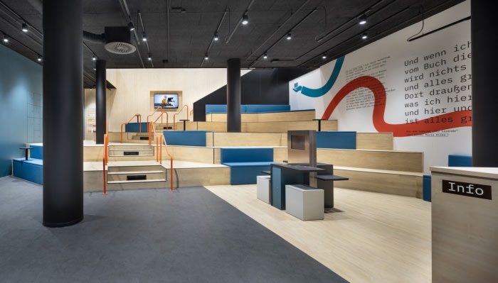
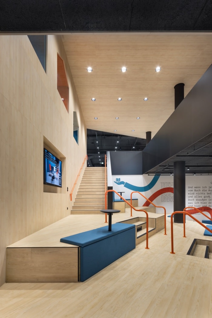
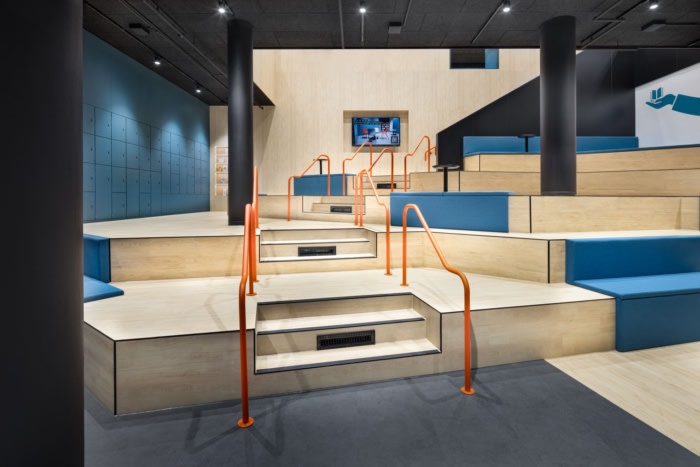
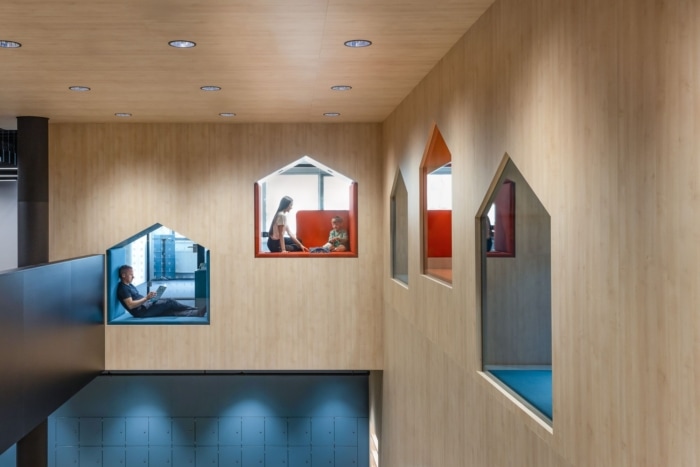
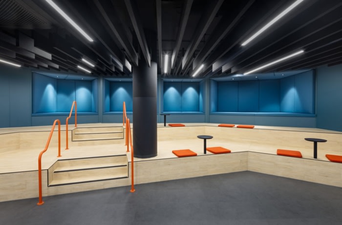
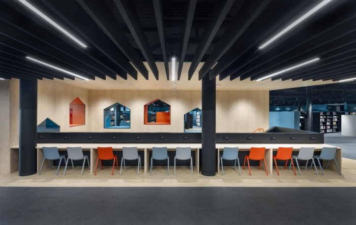
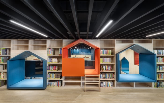
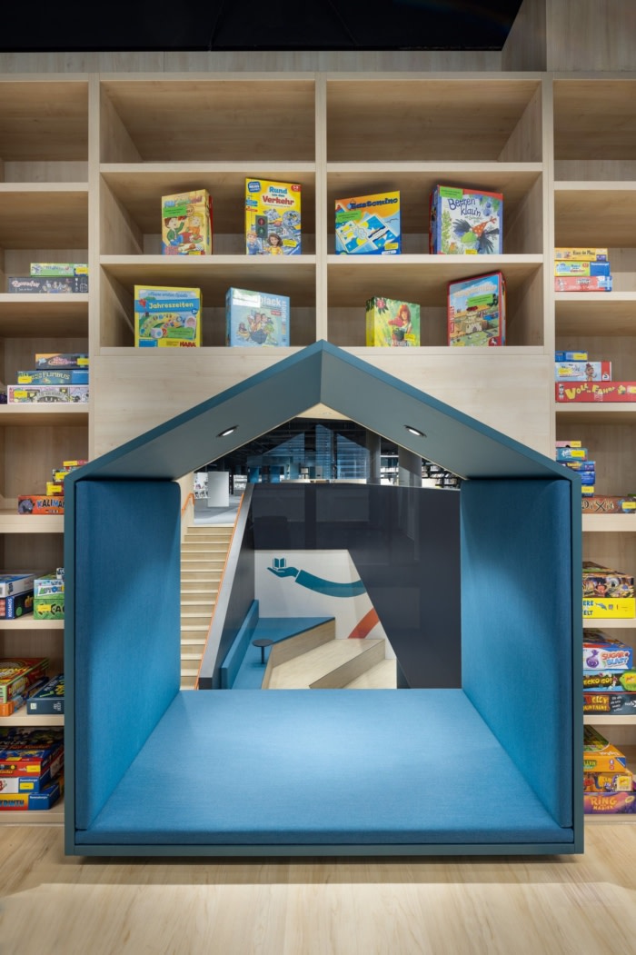
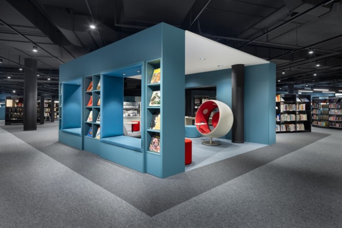
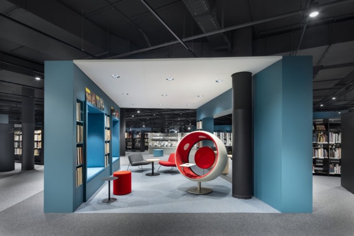
The centrepiece of the concept is a stairway that creates a formal, direct relationship between the library floors and combines a variety of usage scenarios. On the ground floor, it offers a framework for posters, flyers, a signage system and an information screen, while on the up-per floor it forms a large atrium and is at the same time the rear wall of the 340-square-metre children’s area. Integrated reading and playing niches, which evoke tree houses, open up interesting visual axes to the ground floor. In addition to seating, the latter provides space for readings, film screenings or workshops and allows visitors to experience the library landscape in new ways every time. The area can also be partitioned off with a curtain and used for events for up to 50 people. An integrated screen enables multimedia presentations.Design concept: A symbiosis of functionality and aesthetics
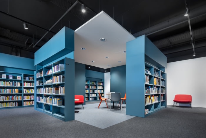
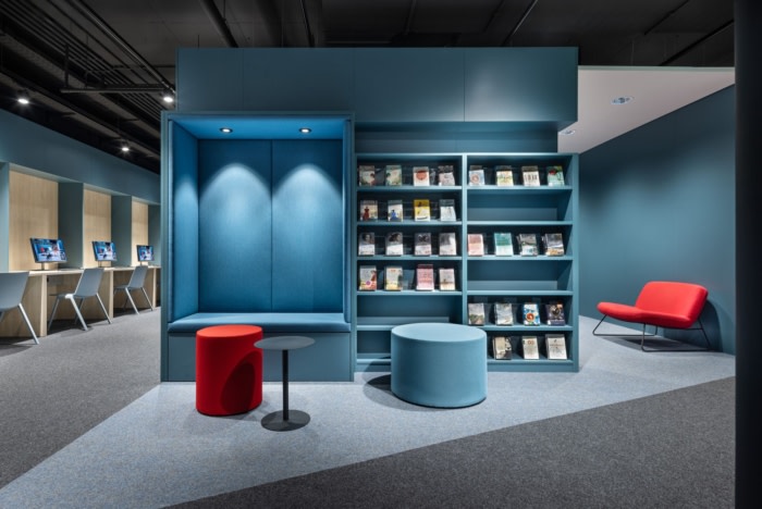
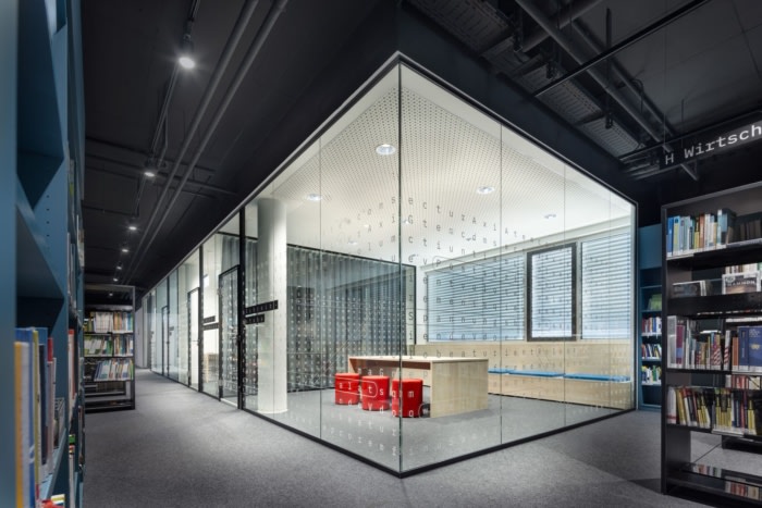
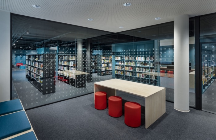
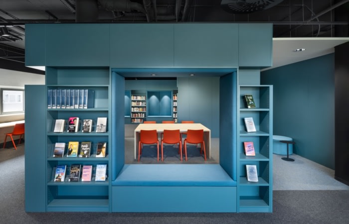
The starting point for the design concept is the evolving reading and communication culture, as well as the aim of meeting the requirements of a variety of user groups in the long term. Education, reading and intercultural interaction will be anchored as a positive experience and the city library with its contemporary look will move forwards into the coming decades as a place of interaction and encounter.DIA finds a creative answer by using partitioning elements, functional walls and digital media to enable flexible usages and a variety of atmospheric qualities. The staircase as a communicative centre fosters social togetherness and intergenerational interaction, while room-in-room cubes and semi-open lounge areas offer a focused learning and reading atmosphere for those seeking peace and quiet.
Material world: Choice of materials supports long lifecycle
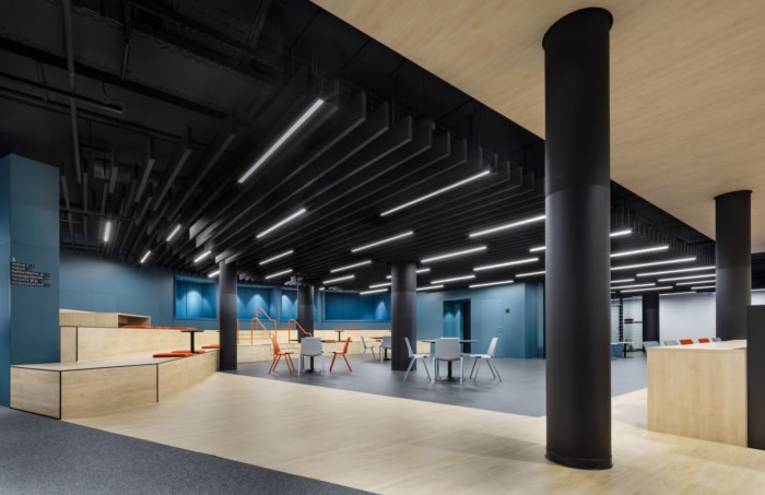
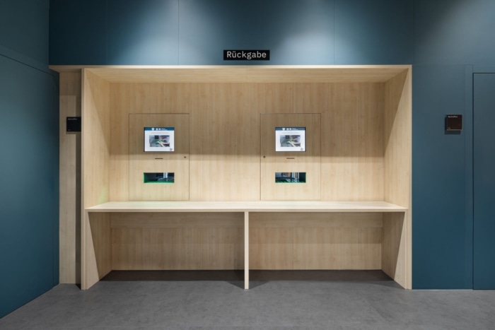
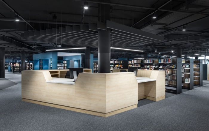
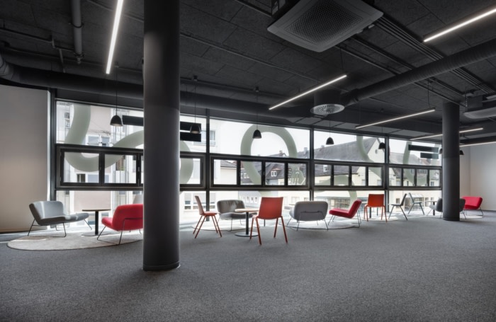
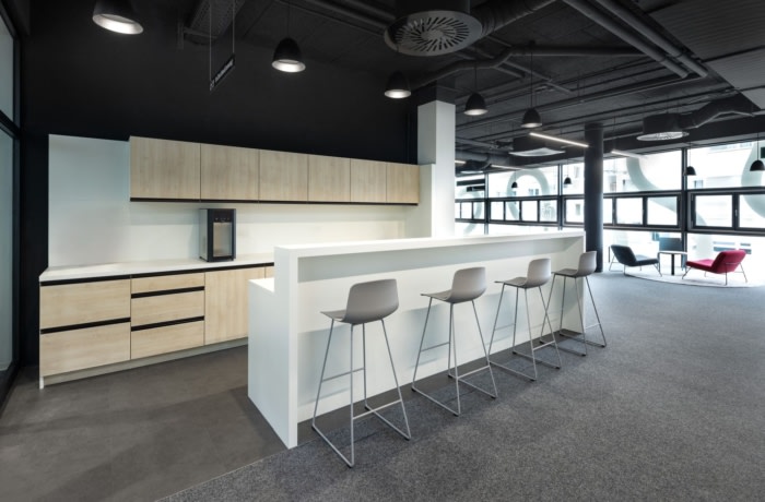
The design concept makes use of a timeless palette of materials and colours, as well as durable materials. A dark grey, hard-wearing floor covering is used in the most highly frequented areas, such as the entrance area on the ground floor. The main areas of the library have an acoustically effective floor covering made of carpet tiles, creating a pleasant and quiet atmosphere. Within the individual areas, the spatial configurations can be changed and adapted to new requirements as needed without major structural work, as only the key elements are permanently installed.Colour concept: Colour accents create visual highlights
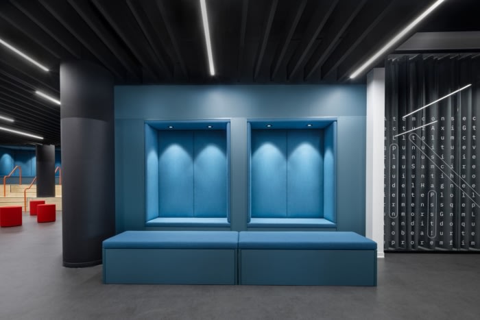
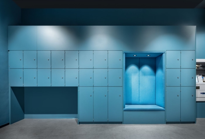
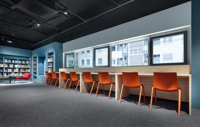
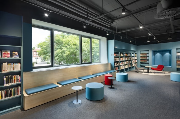
The furniture and upholstery fabrics were implemented in two contrasting colours: a calm petrol, which characterises the functional walls, and a fresh red-orange, which features as an accent colour. To ensure a long lifecycle for the city library, only the interchangeable modules feature the accent colours, while the large surfaces and permanently installed modules were realised in timeless nuances. Partially white wall and ceiling surfaces and the warm colour tone of the maple wood ensure brightness and a natural atmosphere.The city library has become a place with a strong identity that stands for lifelong learning, high-quality information sources and personal interaction. With a contemporary design, Dittel Architekten have found an answer to today’s requirements when it comes to learning and intercultural interaction. They have created a venue that invites you to linger and browse in a cosy atmosphere.
Design: DIA – Dittel Architekten
Photography: Martin Baitinger





Now editing content for LinkedIn.