Walsh College
Valerio Dewalt Train Associates has completed a large-scale campus transformation project for Walsh College located in Troy, Michigan.
Walsh College in Troy, Michigan, provides advanced business education to adult professionals. The majority of Walsh students work full-time in the business community and attend classes in the evening. The campus grew organically since its inception in 1970 until it enlisted Valerio Dewalt Train Associates to strategically analyze, design, and implement a campus-wide master plan to increase capacity and flexibility. The goals were to maximize opportunities for student life, improve the student service experience, increase Walsh’s architectural presence along Livernois Road, and allow student activity to be visible from the street.
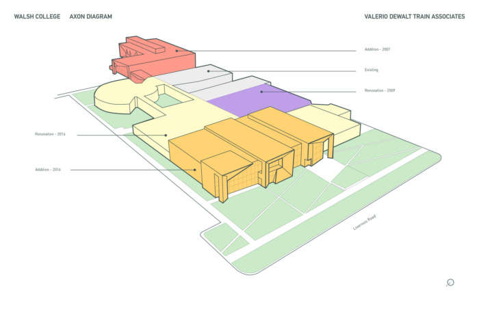
The completion of the first phase—the construction of the Barry Center in 2008—established a new architectural precedent, with new facilities geared toward student learning and resources. The second phase provided better support spaces for faculty. The last phase of the project, completed in the spring of 2016, included a major addition along Livernois Road, significant renovation of existing space, and improvements to wayfinding.
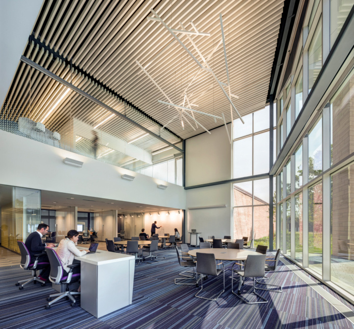
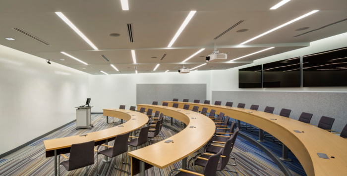
Walsh, like most business schools, uses project-based learning relying on the case study method: students work in teams as their principle pedagogy. In order to ensure their success, Walsh needed to provide not only teaching space, but also a range of study and collaborative spaces for the student teams. The new architecture connects students, faculty, and staff with an expanded inventory of different types of rooms and collaborative spaces similar to the work environments of the most progressive companies, helping to encourage innovative thinking and collaboration.
Master Plan – The planning process began with the collection of quantitative and qualitative data from design team immersions on campus, utilization studies, stakeholder interviews, student surveys, benchmarking, and best practice studies.
Drawing on this data, we developed three major recommendations:
- Increase capacity to accommodate continued growth.
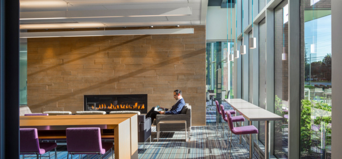
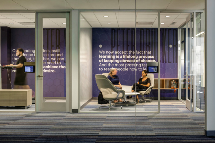
- Facilitate connections by adding more collaborative work and leisure spaces, including open lounge spaces, meeting rooms, and work rooms that could be used by students, faculty and staff.
- Improve Walsh’s public presence along Livernois Road with architecture that enhances visibility and transparency from the street.
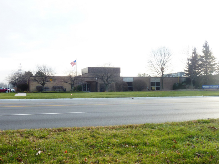
Design: Break the Box – The oldest buildings presented two problems. First, the public face of Walsh College along Livernois Road was a blank brick wall, with only a single door, and a few narrow windows. Second, with their low height, light construction, and worn-out systems, these buildings were not good candidates for renovation.
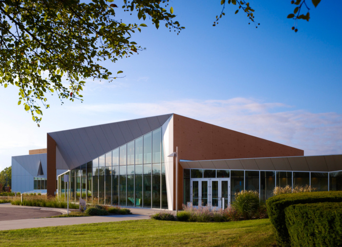
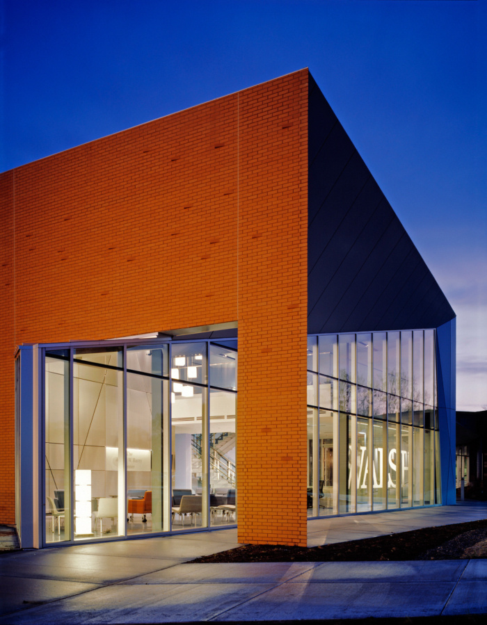
The existing buildings were brick boxes—sturdy, durable, and cost effective, but lacking access to natural light. Beginning with the Barry Center, we sought to provide a signature design that would be compatible with the existing structures yet create the sense of a special place.
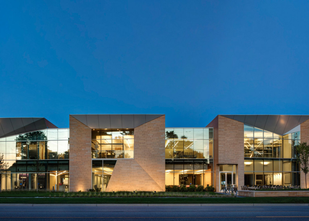
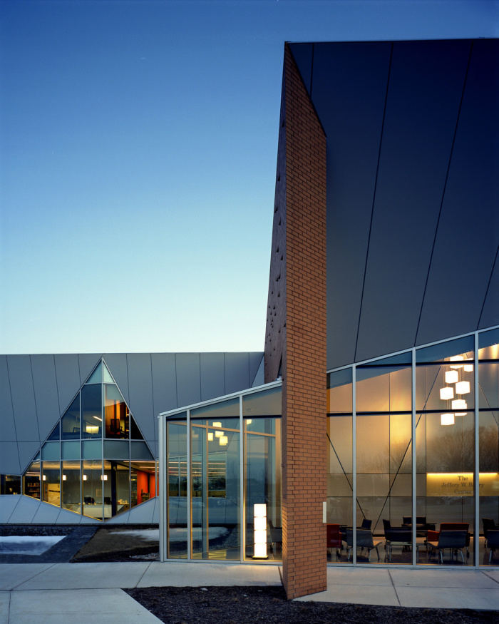
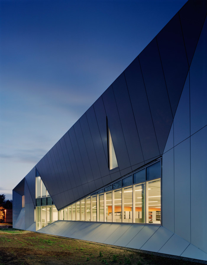
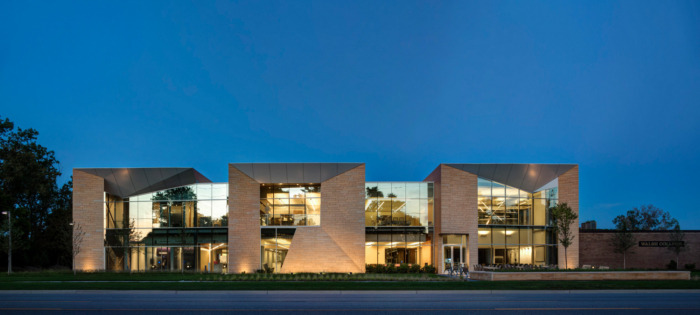
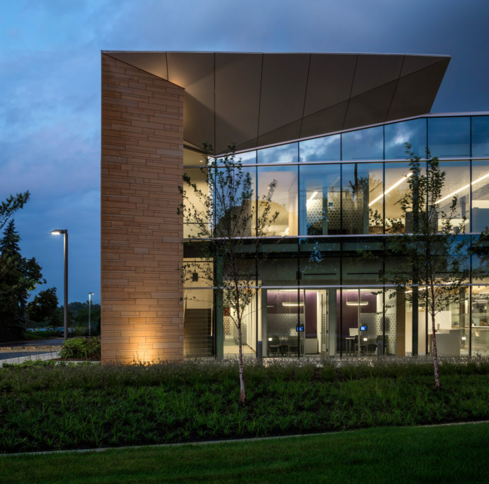
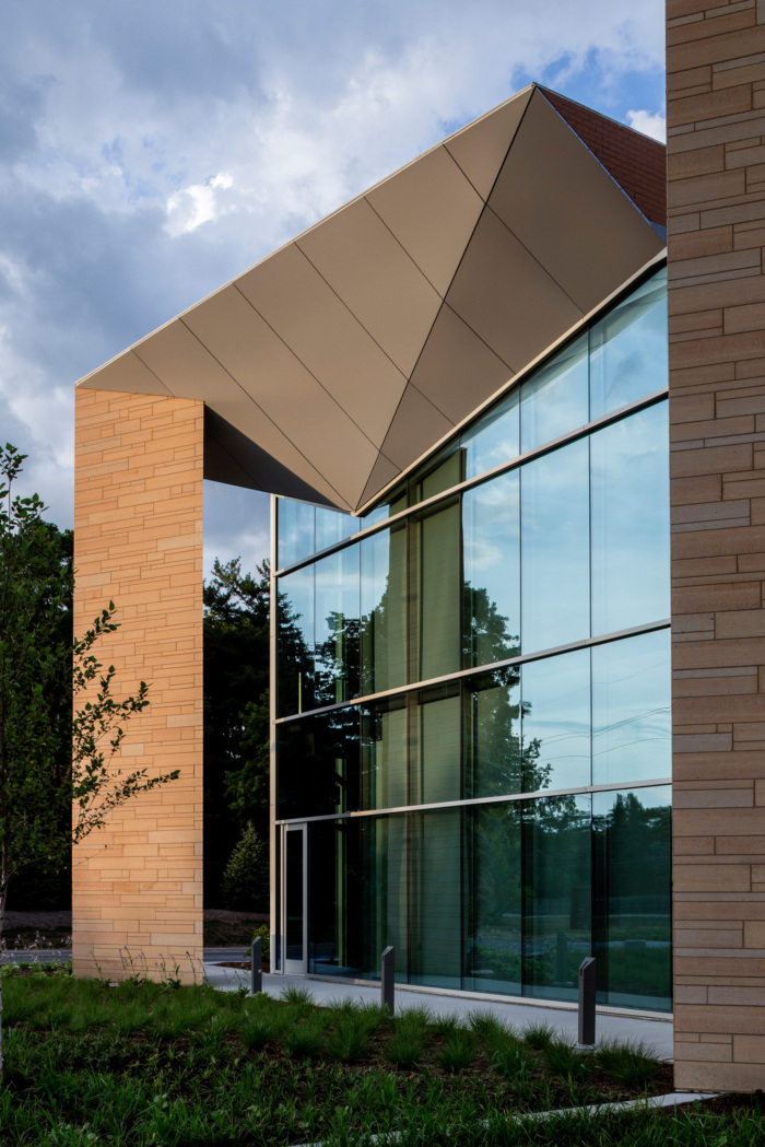
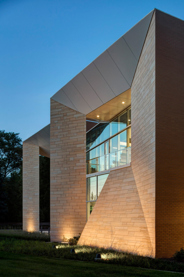
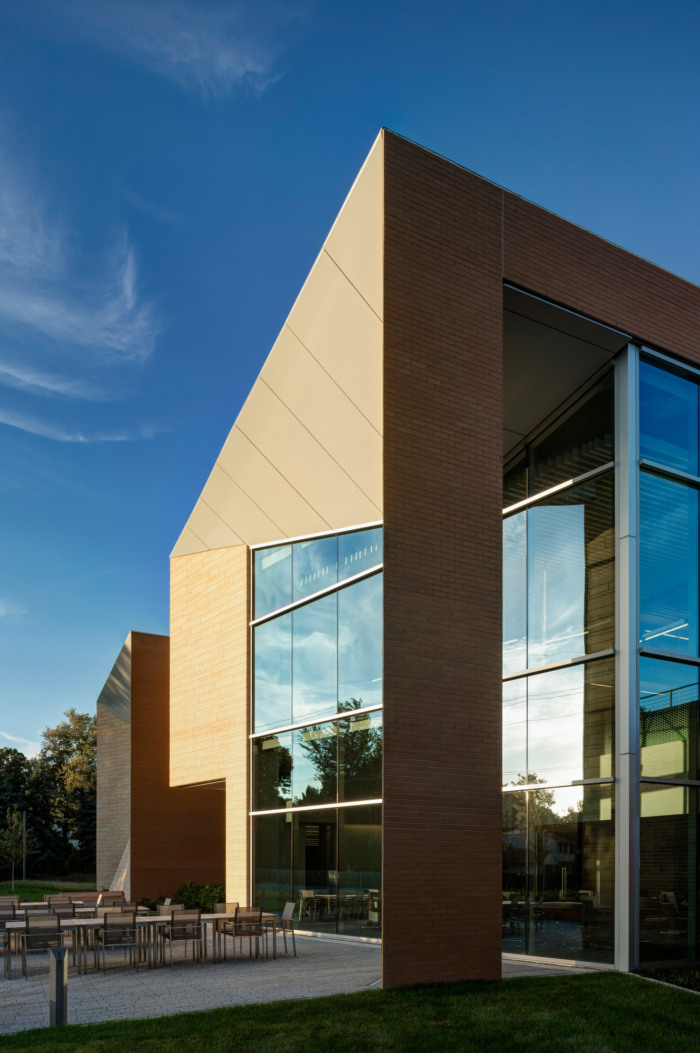
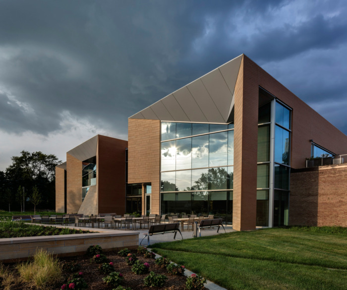
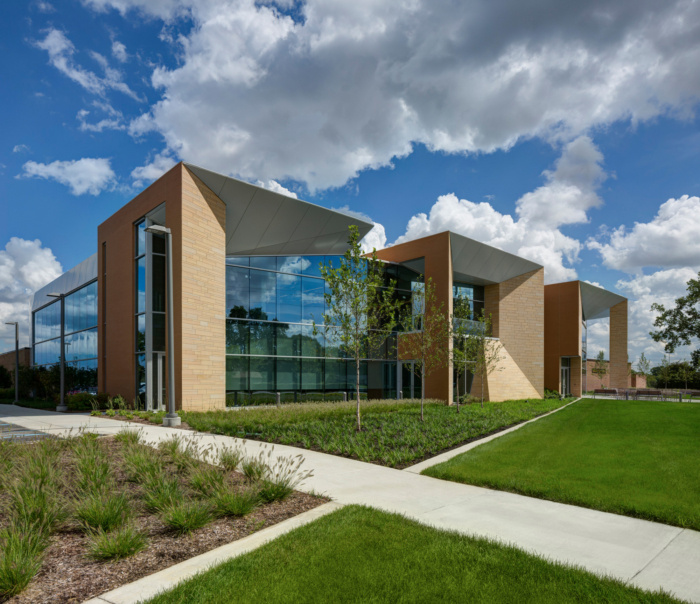
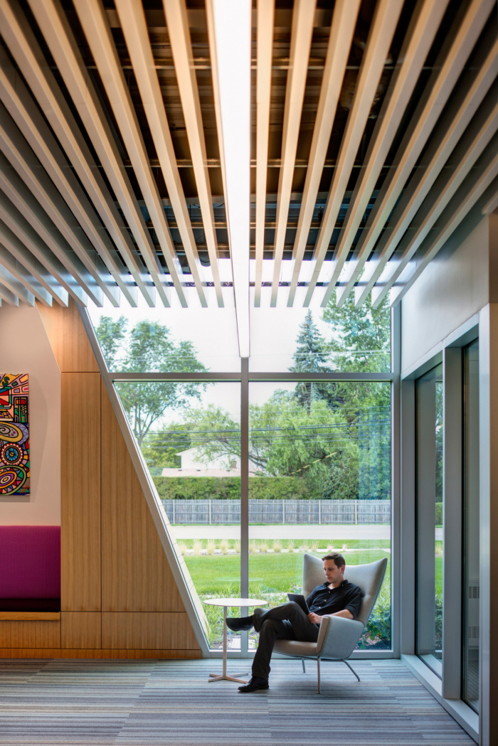
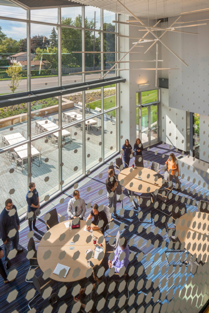
The design of both new buildings embraces the brick box, but while the sides of the new boxes are brick, the public-facing walls of the new buildings incorporate metal paneling and, in the case of the Livernois Road addition, Vetter stone. These walls angle inward to frame large windows, allowing community members passing by on Livernois Road to see the activity within the building. This is especially true at night, when the building is lit up like a series of glass lanterns and the college is the most alive with student activity.
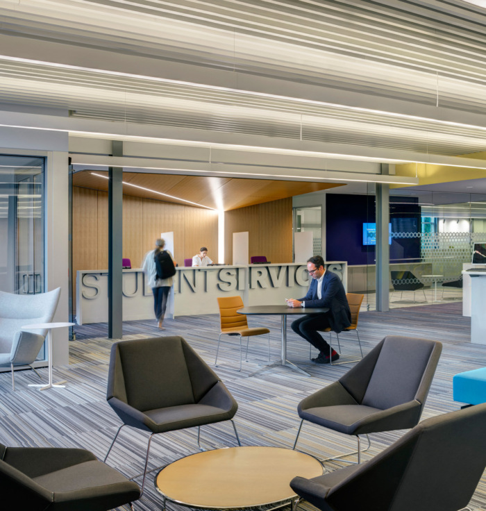
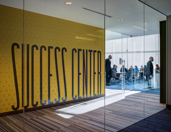
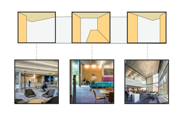
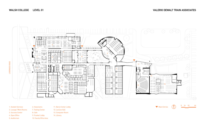
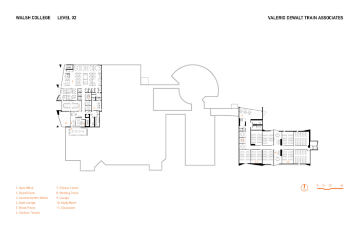
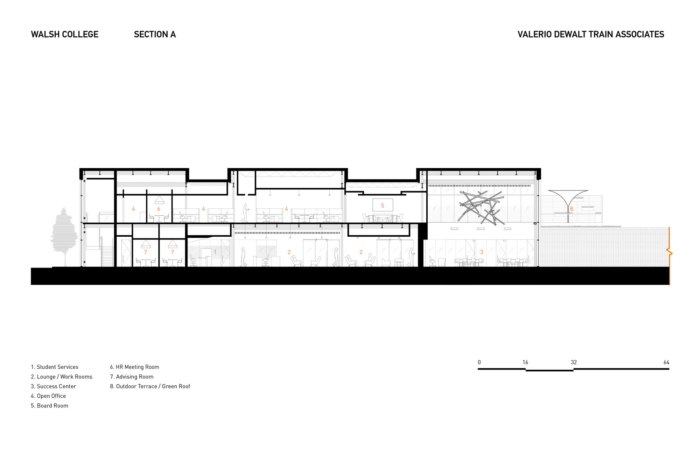
The Livernois Road addition picks up on the formal language of the Barry Center’s sharp geometry and material palette. The addition consists of three distinct pavilions, each denoting its interior program: a “one-stop shop” for student services, a student lounge, and a “success center” dedicated to cultivating students’ professional communication skills. Though each pavilion has its own distinct geometric expression, they share the same architectural language.
Improve Circulation – Due to the organic growth of the campus, the floor plans of the existing buildings were confusing at best. The first decision was to develop a circulation concept that would simplify wayfinding by enabling users to quickly create a cognitive map of the campus.
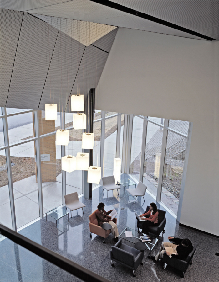
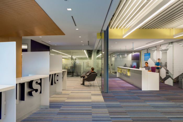
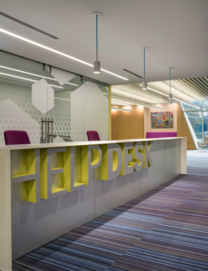
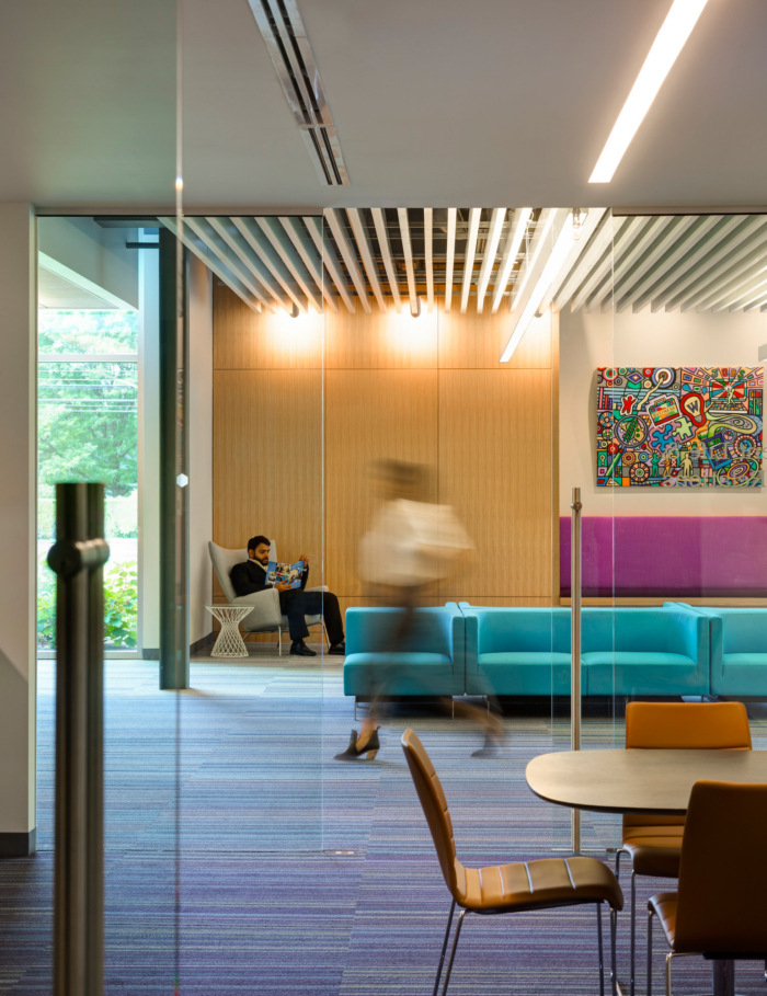
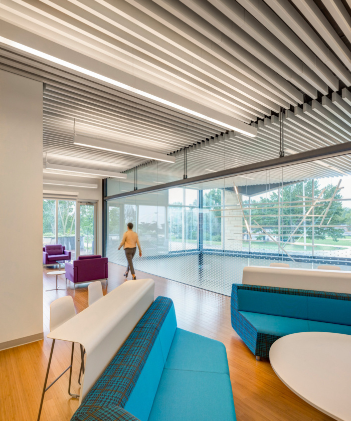
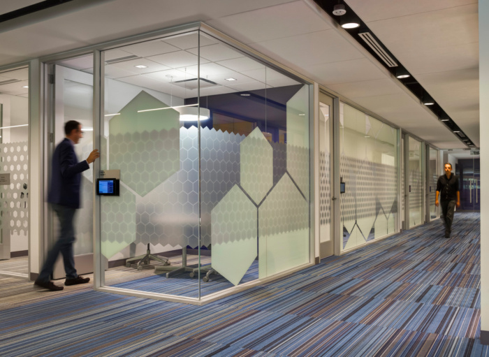
Two primary north/south paths organize the complex, terminating in large open lounge spaces to the east and west. To the greatest extent possible, the walls along the path are glass, exposing activities to everyone, except where privacy is required.
Additionally, our Media Objectives design team created site-specific graphics to enhance wayfinding as well as strengthen place-making and the school’s visual character.
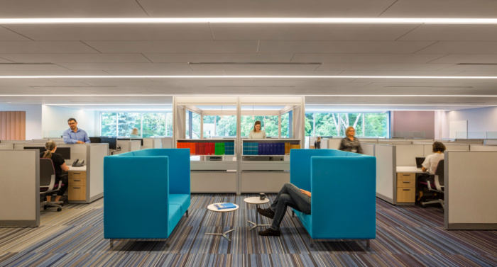
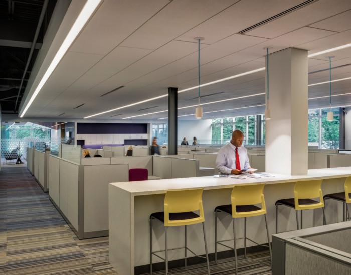
Open Interiors – Major changes to the organization and operation of existing administration space—most significantly the dissolution of all private offices for administrative staff—freed up substantial square footage to be reconceived for student use. The renovations throughout the areas connecting the two end of the campus not only updated the facilities, but also instilled an aesthetic coherence across the college as a whole.
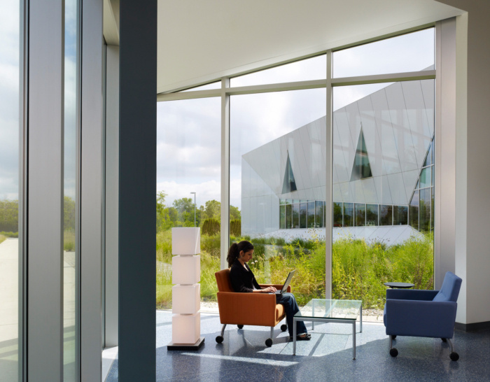
Glass was used to open the interior to the sun and to connect the college to the natural landscape and community along Livernois Road. Interior glass allows students to see each other learning and to feel a greater connection with staff and faculty.
Architect: Valerio Dewalt Train Associates
Photography: Justin Maconochie








Now editing content for LinkedIn.