Memphis Teacher Residency
archimania was given the task of designing the inspiring learning space for Memphis Teacher Residency in Memphis, Tennessee.
Memphis Teacher Residency, a faith-based, non-profit organization required a new space for recruitment, training, and supporting teachers through an urban teacher residency graduate program.
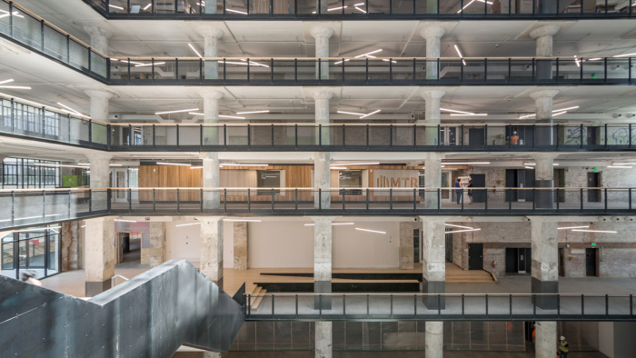
As the context for their new home, the organization decided on a large and recently renovated Sears distribution center that sat empty and decaying for 17 years. MTR was one of eight founding tenants in arts, education, and healthcare involved in realizing the newly transformed, one million square foot “urban village”, Crosstown Concourse. Crosstown Concourse contains all the essentials for a thriving community. MTR became the first tenants to move into the facility—a unique space distinctly suitable to serve its operation and mission. The visionary organization understood the value of investing in a project that has, as imagined, had a dramatic impact on transforming the Crosstown neighborhood, one of the most ethnically diverse and economically challenged in Memphis. Students reside in the apartments located within the same building, which also features a YMCA, hospital, high-school, grocery store, retail, restaurants, and is three miles from the urban core of Memphis.
MTR’s new space is sited within Crosstown Concourse’s public, central atrium, another smaller, public atrium, and is also open to a private terrace with outdoor seating. A driving design challenge involved ensuring the education facility established a more public presence from the church basement where they first began in 2009.
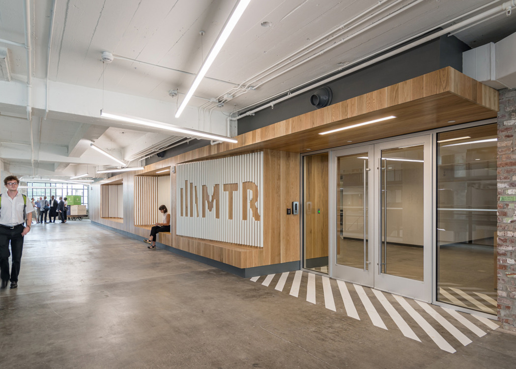
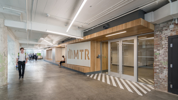
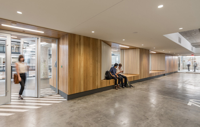
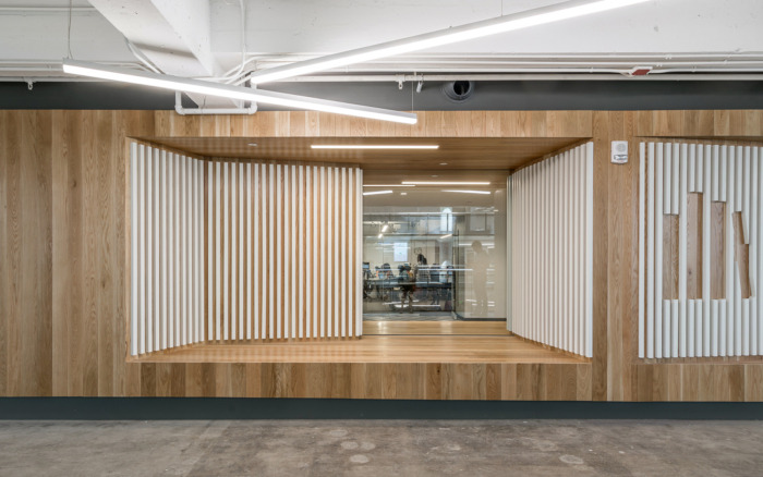
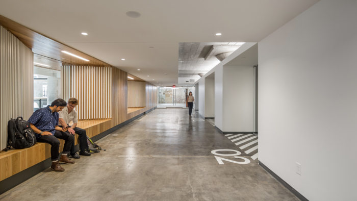
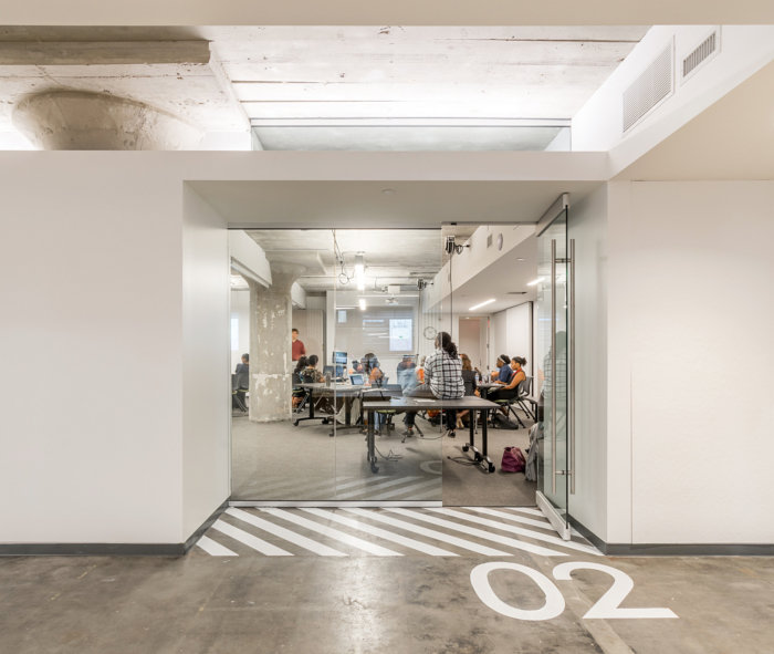
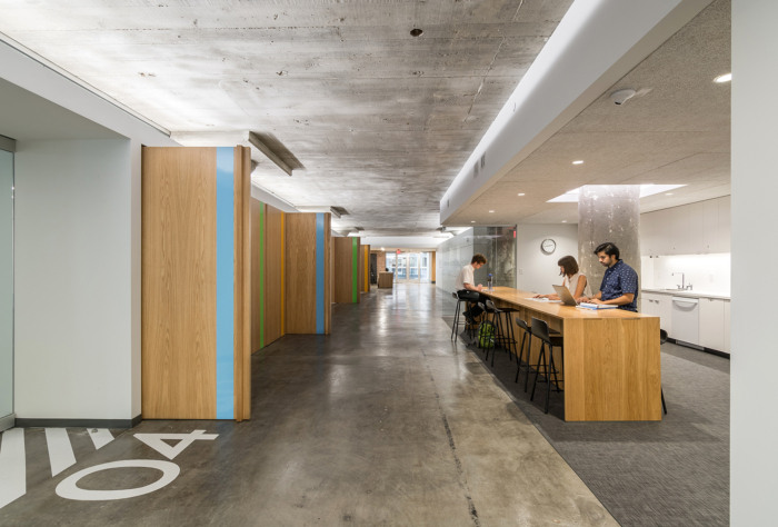
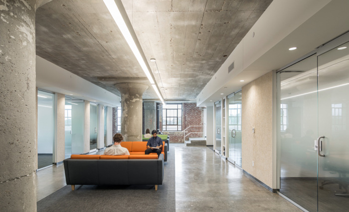
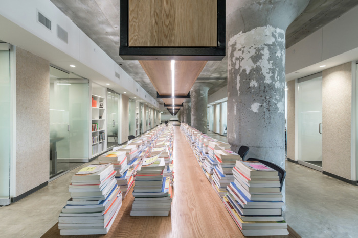
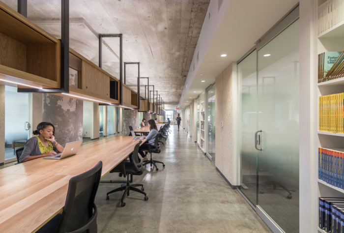
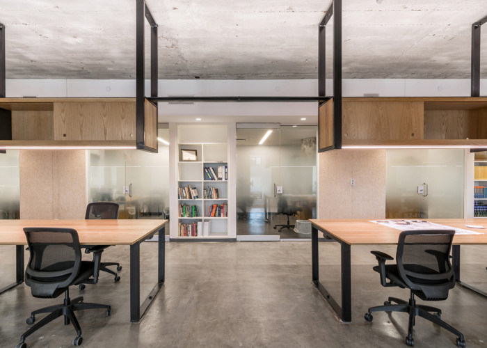
MTR’s new home is made up of three functions: offices, larger training rooms, and community areas for breaks and informal discussion. Wooden space defining elements were used within the community spaces to encourage gathering. These components act as connective tissue between programmatic zones. At the entry, for example, a sign and seating detail offers areas for conversation, waiting, and defines the entrance while also visually communicating the organization’s focus on gathering and community. The use of the warm material also establishes nodal areas for collaboration.
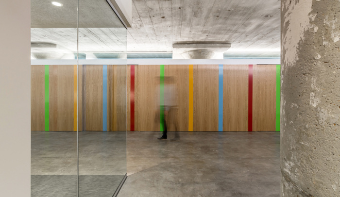
The client’s distinct use of book icons to express a source of knowledge translated into an architectural language and graphic spatial detailing that colors and meters the large space. The maturing, home-grown organization further defined its brand through a spatial and material relating to the gritty context of the existing building.
Design: archimania
Photography: courtesy of archimania








Now editing content for LinkedIn.