Missouri State University – Davis Harrington Welcome Center
Dake Wells Architecture was given the task of designing the Davis Harrington Welcome Center for Missouri State University in Springfield, Missouri.
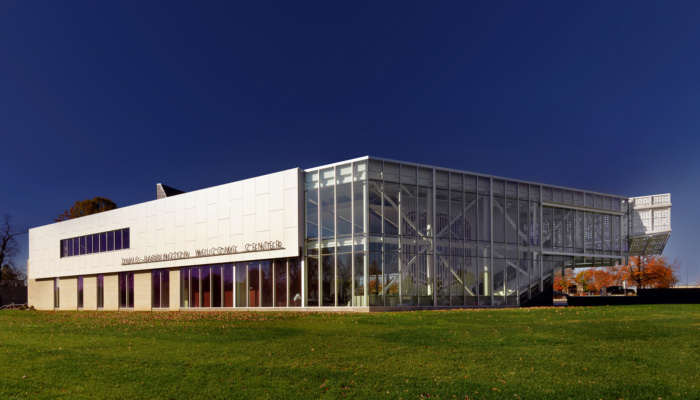
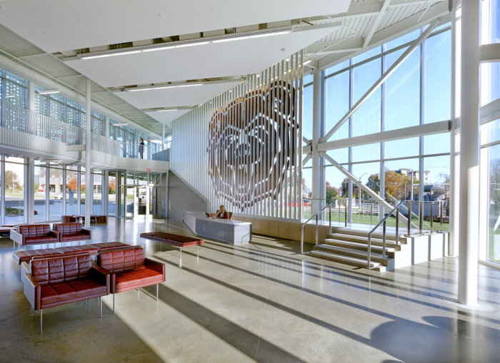
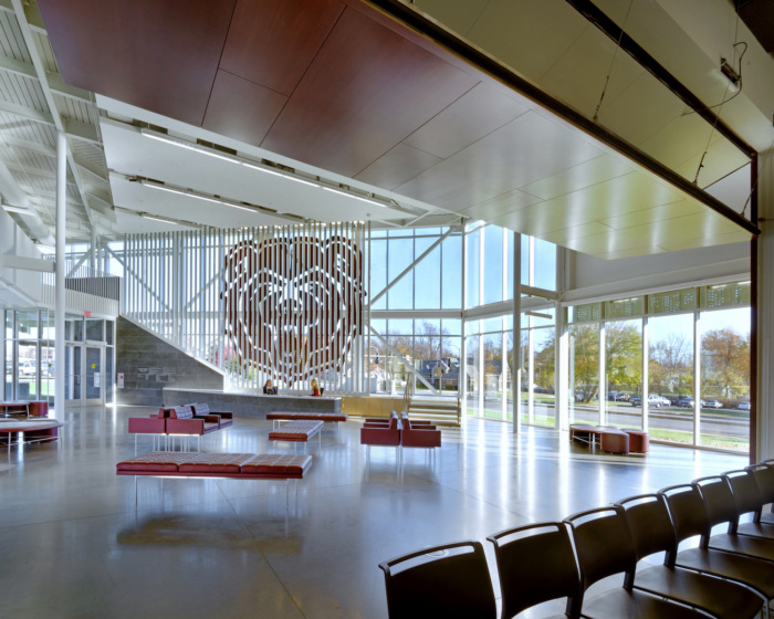
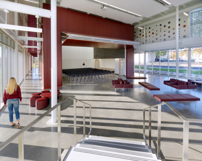
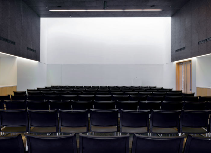
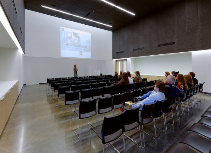
In the highly competitive world of higher education, first impressions are critical. Building on the strength of Missouri State University’s long history and brand image, this new 13,000 square foot facility serves as the institution’s “front door”, welcoming visitors to the campus at its primary entrance. In addition to providing a point of origin for campus visits, the two story lobby and 100 seat presentation room provide a multi-purpose venue for special events such as press conferences, speaking engagements with distinguished guests, and networking events. Tasked by the University with providing a “signature piece of architecture”, the design solution is both economical and monumental. Originally founded in 1905 as a teacher’s college, Missouri State University now carries the Public Affairs mission in higher education for the state.
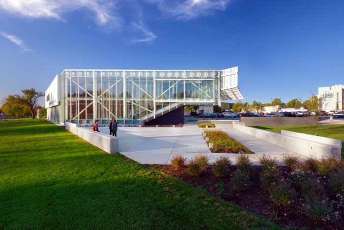
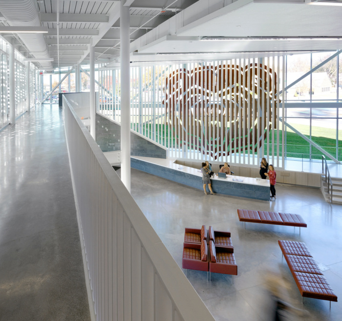
The building program is arranged in a two-story scheme, placing administrative functions on an upper level in order to increase the building’s visual presence as it reinforces the campus edge. The scheme considers a future expansion that will relocate existing admissions and registration services to this location, providing a one-stop-shop for new applicants.
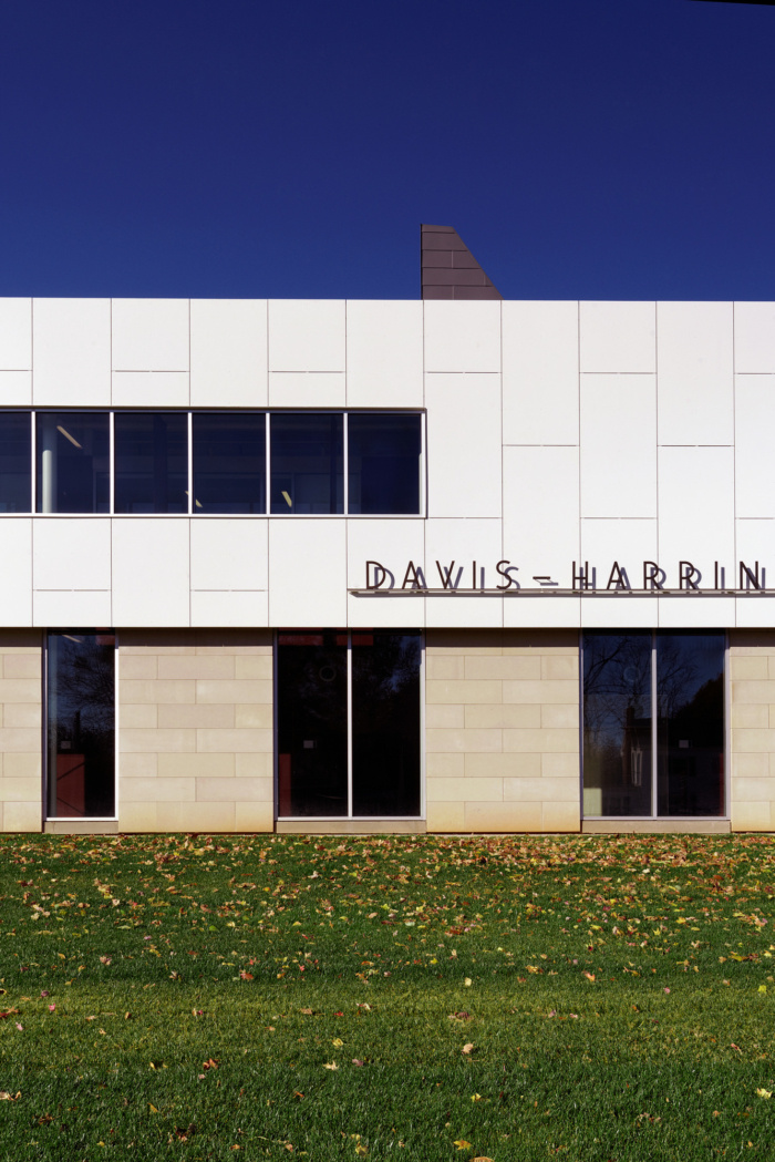
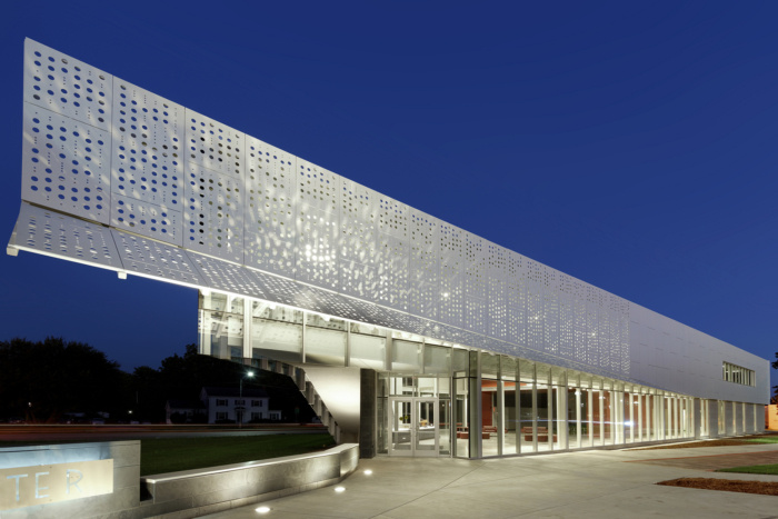
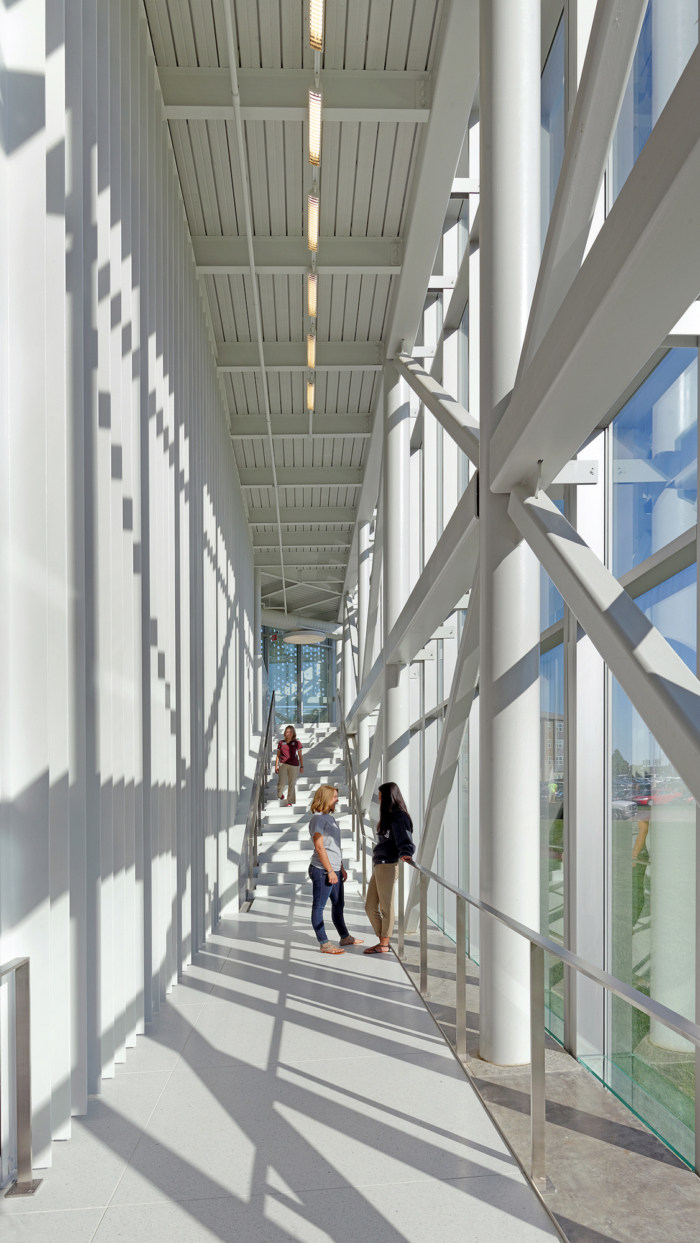
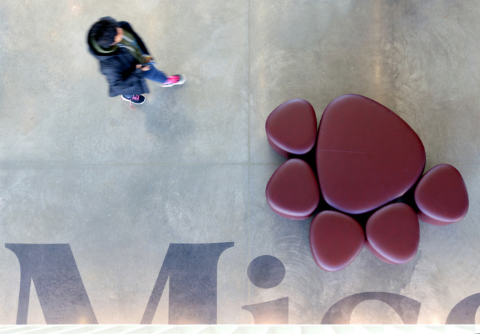
The building enclosure is derived from the surrounding campus context combined with an interpretive reading of the institution’s history and mission. Limestone provides a durable and contextual surface at the ground, increasing in transparency to the north toward the entrance. Two white planes are elevated above the base defining the east and west facades, almost paper-thin. A two-story curtain wall angled toward the campus entrance serves as a gesture to welcome visitors and increase the building’s transparency. The west plane extends slightly beyond the pointed corner of the building signifying the main entry point to the building and folds slightly away as if dog-earring a page for future reference. Circular perforations derived from the pattern of a composition booklet provides added shade on the west facade and dappled light in the lobby interior. A wall of slate recalling the classroom chalkboard provides the backdrop to the building’s entrance and defines a generous reception desk for student greeters, with a twenty foot maroon and white bear suspended from the structure.
Visitors can experience the University through interactive displays on their own, or participate in a guided tour that begins in the lobby, moves to the presentation, then through the linear gallery and out onto campus. Recognizing the capacity of architecture to both engage and inspire, Missouri State University is strengthening its position in the higher education market while staying true to its mission to educate citizen scholars.
Architect: Dake Wells Architecture
Design Team: Andrew Wells, Bethany Henry, Cara Collins
Contractor: Wright Construction
Photography: Gayle Babcock








Now editing content for LinkedIn.