eStem East Village Elementary & Junior High School
WER Architects transformed a space into the eStem East Village Elementary & Junior High School located in Little Rock, Arkansas
Holding true to the contextual setting of the surrounding area, our design team deconstructed and reconstructed a 1940’s warehouse into a thriving elementary and junior high school. There were several pieces to this design puzzle but the keys to success were the following: 1) Create two unique campuses out of one building. 2) Address traffic flow of an elementary and junior high in an industrial area. 3) Take a misshapen 1940’s warehouse in disrepair and create a unique school that folds into the context but also leads the way in revitalizing and reinventing East of I-30.
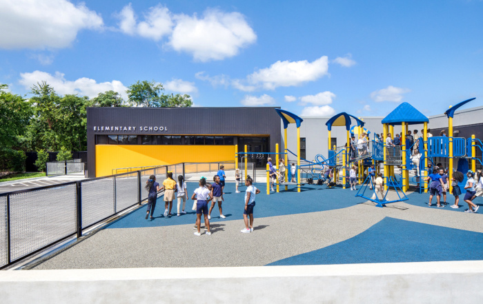
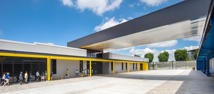
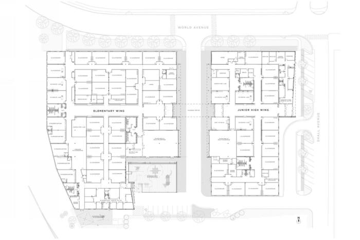
After analyzing the program and our site we realized we could solve more than one problem we had by simply cutting the warehouse into two pieces. Dividing the structure allowed us the opportunity to create a safe and efficient way to drop-off/ pick-up children and separate the Junior High from the Elementary. By providing gates at both ends of the drive we were also able to make this drive double as a recreation area.
The biggest parameter to overcome was the existing structure. The warehouse had been originally built in the 1940’s and had taken on many different purposes in the past 80 years. Due to multiple additions, poor soils, and being partially destroyed by a tornado in the 90’s, the building was misshapen and in disrepair. Not to mention, the floor sloped 2 and a half feet from one end of the facility to the other.
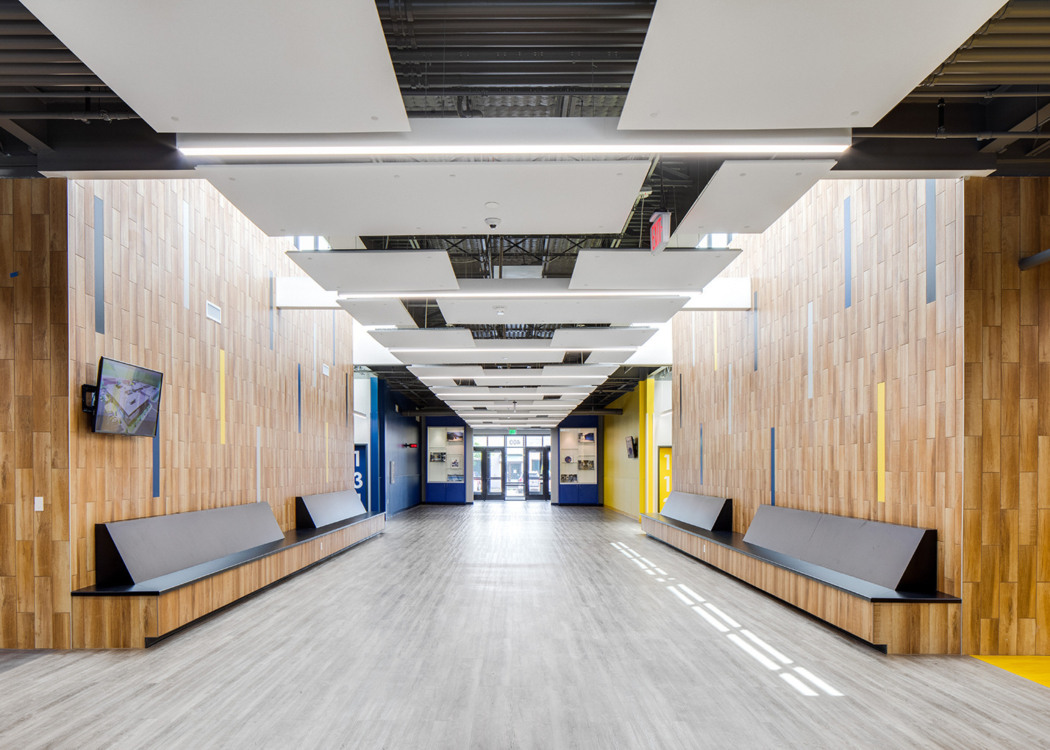
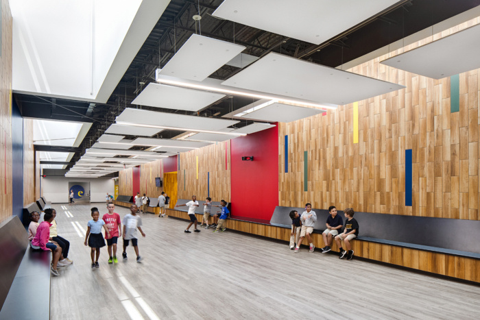
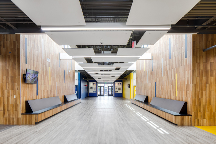
Despite all the negatives of this structure, there were many advantages to using this warehouse that would provide a unique environment that most schools do not have or can’t afford with ground up construction. The current structure had lofty ceilings to accommodate the previous functions and had a surplus of square footage, even after cutting in a drive. This allowed us to provide very wide and tall hallways and even an indoor playground in the Elementary side. This, and the several light monitors cut into the roof, creates a rich dichotomy. The interior is industrial but also bright, lofty and aethereal.
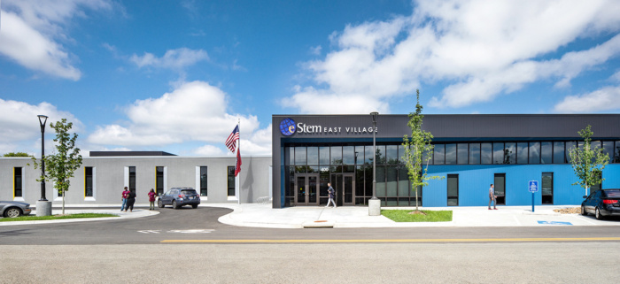
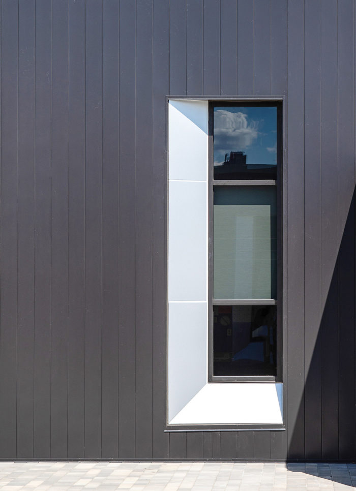
The exterior of the building was primarily tilt-up concrete panels which highlighted the fact that this building was previously a warehouse. Instead of trying to conceal this, we embraced the appearance and reinvigorate the panels by cutting in new windows for classrooms and repairing/repainting. To create two different entries for the two schools, we cut in two simplistic elegant boxes, accented with the school’s colors, blue and yellow, to create hierarchy. Using metal wall panel to maintain the industrial aesthetic, we created a unique transition between the new and old that highlights the entry points from the street as you approach.
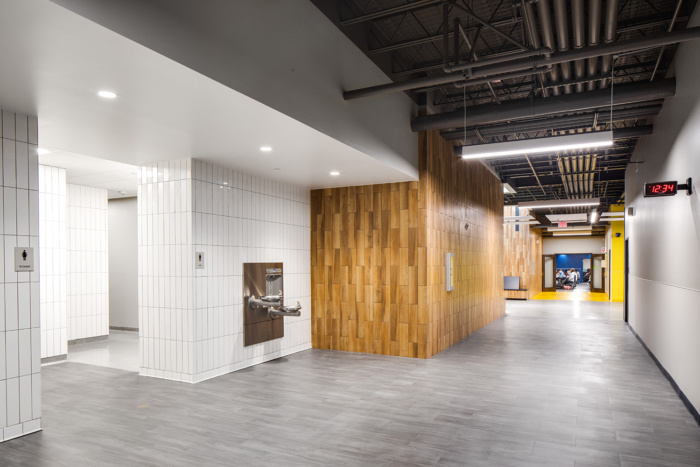
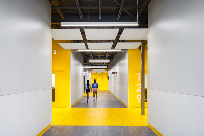
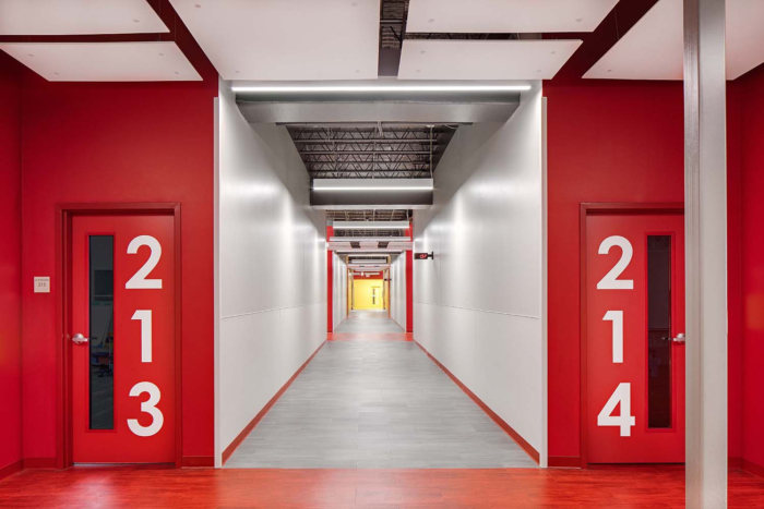
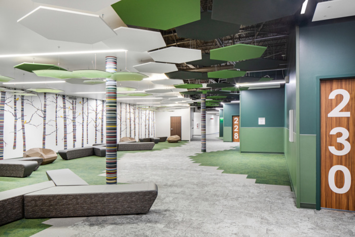
This simple use of color blocking at the entries was used throughout the building as a wayfinding system for the younger children. Kindergarten in the Green zone, 1st Grade in the Red corridor, etc. This simplified and overscale color blocking pulled the modern yet industrial feeling to the interior of building as well. This was exemplified even more by exposing the structure and mechanical systems in the public spaces.
The neighborhood chosen for this campus was not an ideal location for a school, but bringing it into this neighborhood has helped revitalize a forgotten part of the city and brought new life and energy to this old industrial area.
Architect: WER Architects
Photography: Chad Mellon






Now editing content for LinkedIn.