Frankston Primary School
Chaulk Studio created the design for Frankston Primary School located in Frankston, Australia.
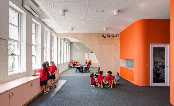
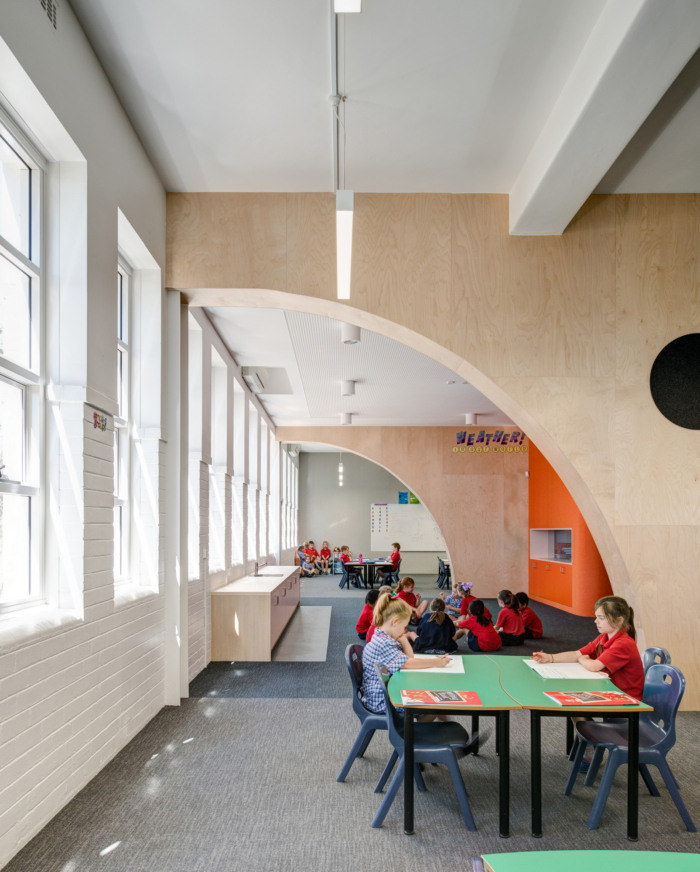
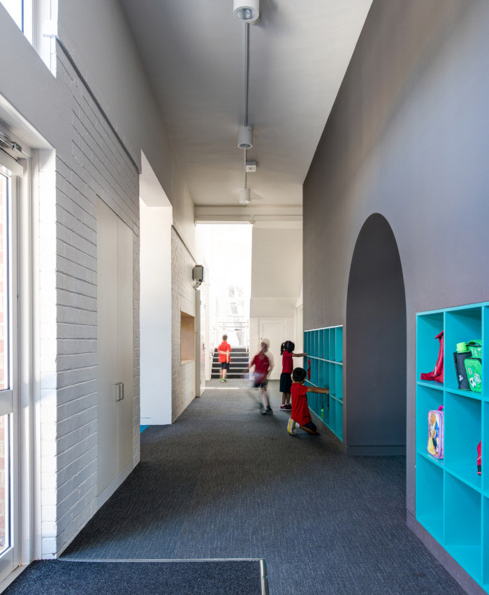
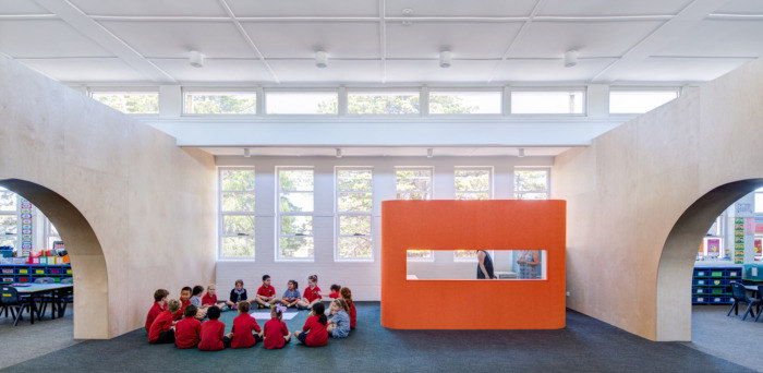
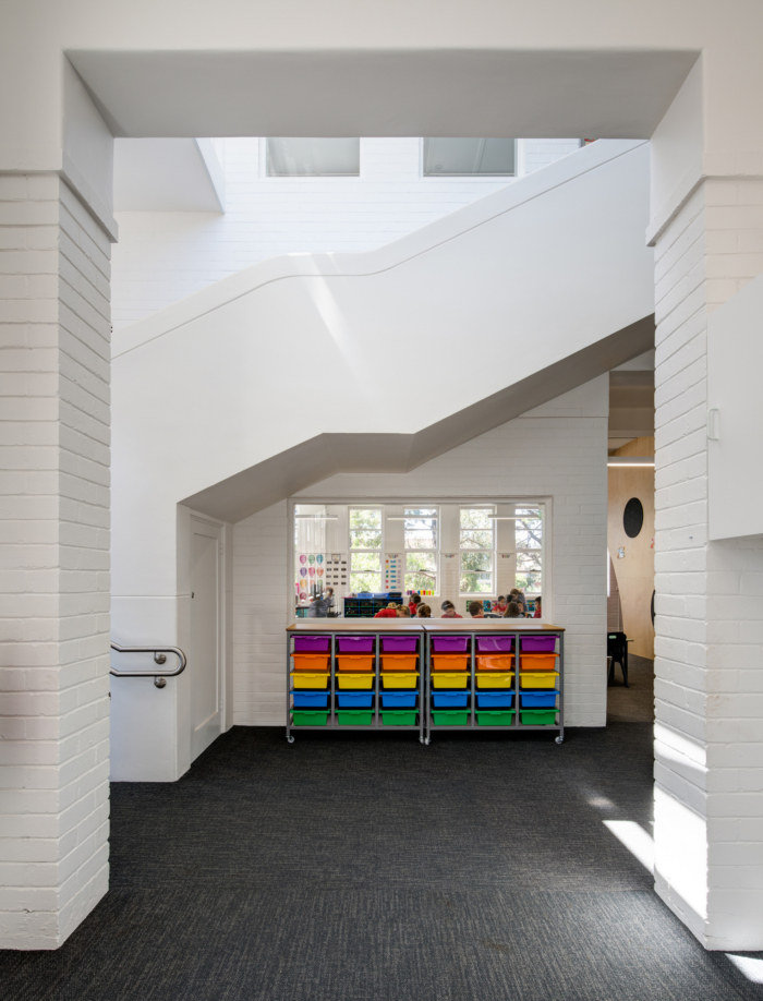
The Frankston Primary School Early Learning Centre involved the refurbishment of a two-story art-deco schoolhouse to create an exemplar learning facility that supports 21st-century learning. Cell-like classrooms accessed by long dark corridors are converted into light, bright and exciting learning environments. The design solution creates a flexible and adaptable environment by providing a combination of teaching, break-out, wet-area and small meeting and work spaces throughout.
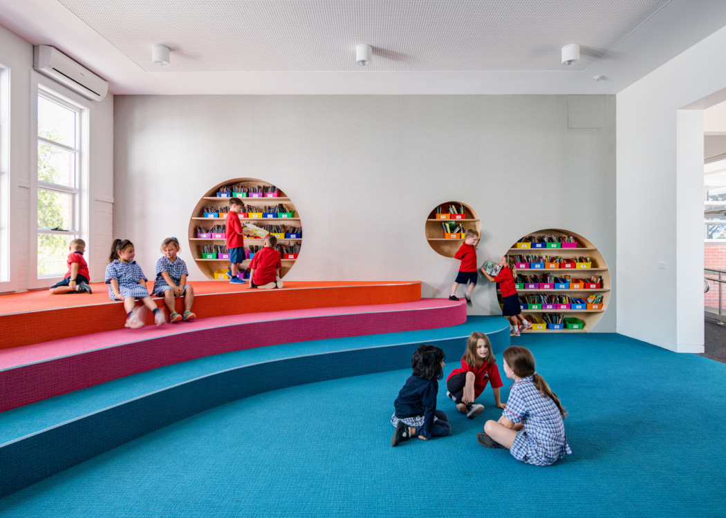
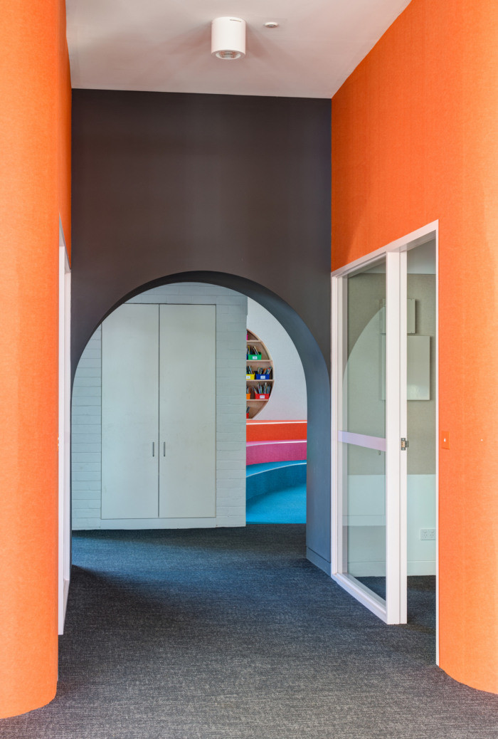
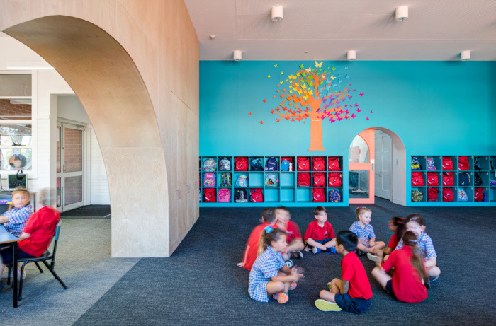
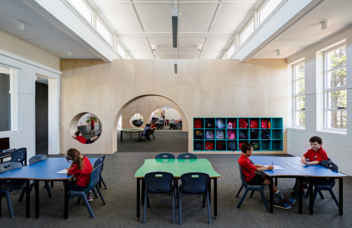
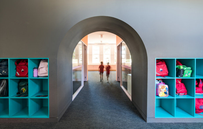
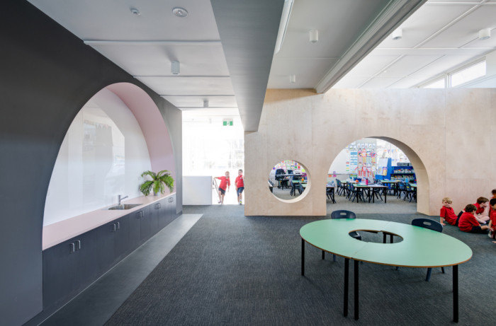
The spaces are designed to be customizable with large blackboard and pinboard walls. Low-slung archways, that envoke the spirit of JR Tolkien Hobbit Houses, are employed to create a homely sense of belonging for students and an enticement to explore the space.
Our ambition was to create an environment that enabled the School’s pedagogical philosophies whilst creating a place for students that was exciting, innovative and a place they want to be.
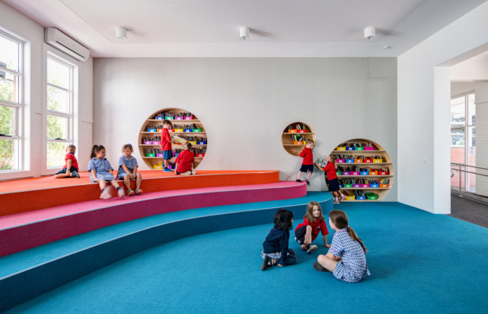
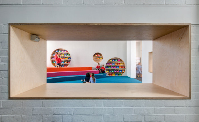
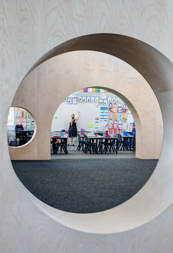
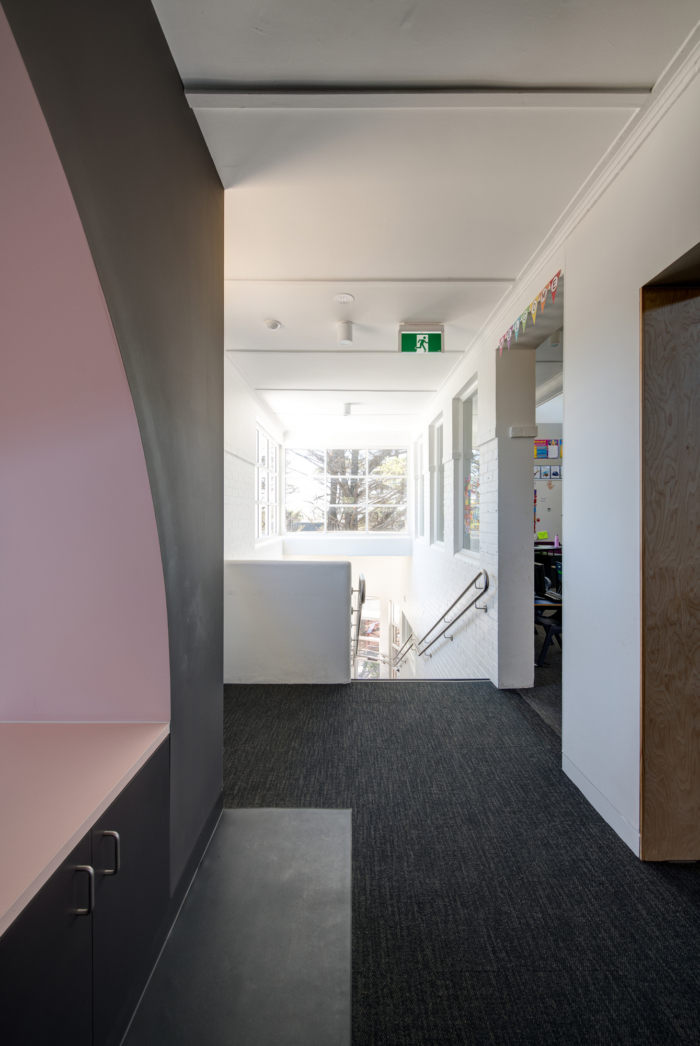
The choice of colour was two-fold. In our experience classrooms can be similar to designing gallery spaces as all surfaces are used for displaying colourful teacher aids (posters etc) and student work. So we adopted a policy to keep the colours and finishes within the main teaching spaces neutral (warm whites and greys) and natural (plywood) so as to not compete with the colours and textures of the displays. However, it’s hard to imagine a school building without colour so we adopted a colour strategy for the other spaces; amphitheatre, break-out and meeting spaces. The concept of the blackboard for it’s customisability was key. We decided black was too harsh for an early learning centre so we chose a colour that was about 70% black and warm in tone. Orange was used for all the meeting spaces. The walls of the meeting rooms are clad in Autex Cube Zenith an orange pinboard material. The teal was selected as it was voted favorite colour amongst students and its used for all the bag lockers. The light pink was selected as it quietly compliments both colours and helps us to merge the two brights in the one
space.Our key inspiration was the low-slung archways seen in the JR Tolkien Hobbit movies. This form seems to invoke a sense of enticement to explore and a sense of cosiness and homeliness. We used the arch form in a variety of ways in walls/thresholds between the various spaces. We also positioned elements such as meeting rooms and pods in such a way as to create a variety of shape and size spaces so students could find their own perch, be it tucked away with a small group or horsing around in a larger space. Steps in the amphitheatre, holes in walls, shelving at low height, are devices we used to invite students to engage and interact with the space.
The planning of the fit-out was carefully thought out with respect to achieving passive supervision and good sight-lines throughout the building. We aimed to eliminate all the corridors (and loitering zones) by removing walls and incorporating the corridor zone into the main break-out spaces. Bag lockers (an area prone to bullying) are brought into the main classrooms wherever possible so the area can be supervised when children are accessing their belongings. The small meeting rooms were included and positioned in such a way as to achieve a sense of privacy for students who may require additional coaching in literacy and numeracy etc. but also where some passive supervision of these spaces (glazed openings
overlooking adjacent spaces) is available as a protective measure for staff.The edges of the meeting pods are curved. Originally this was a small play on the art-deco style, however when we discussed this with the Client they wanted to retain this as a safety feature so children moving around the spaces wouldn’t run into solid corners.
Architect: Chaulk Studio
Photography: Jaime Diaz-Berrio


Now editing content for LinkedIn.