Bernoulli Go – Education Group Unit for Younger Students
Studio dLux was tasked with the job of designing Bernoulli Go! – An Education Group Unit for Younger Students in Belo Horizonte, Brazil.
The Bernoulli education group just launched its new unit, dedicated to the younger students. Bernoulli Go is dedicated exclusively to the primary education.
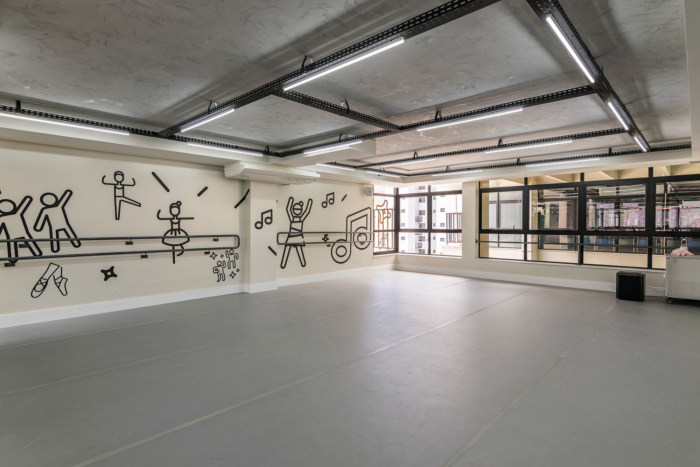
Studio dLux was invited to execute the project in an old industrial building located in the district of Belo Horizonte. The old building, where factories and offices once were stablished, had an fair-faced concrete structure recalling large factories. One of the greatest challenges of the project was to transform this sort of building into an modern and playful school, creating a positive impact, therefore benefitting students, teachers, school staff and parents.
Here are some of the obstacles found in the building:
1. Every floor had a short ceiling height with 2,40m, creating an obstacle in the school structure, which needs spacious environments.
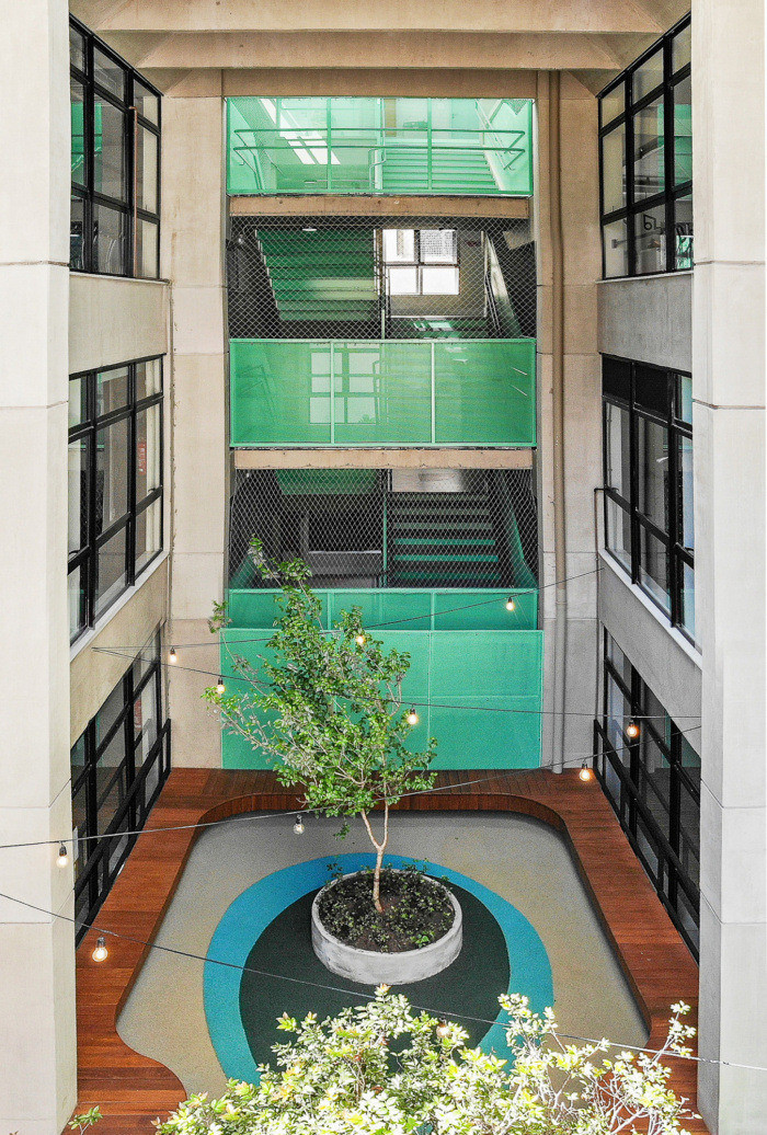
2. The building had terrible natural lighting, due to the short height ceiling and lack of openings. There are two central open atriums that if well-used, could solve the issue.
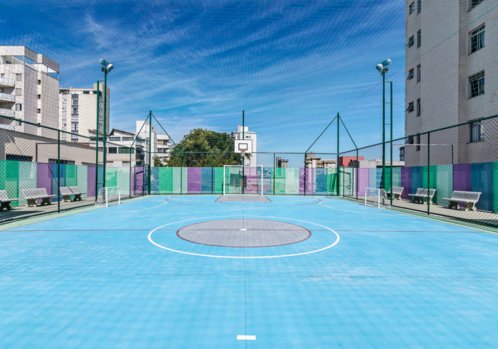
3. The lack of room for a multi-sports court for the students.
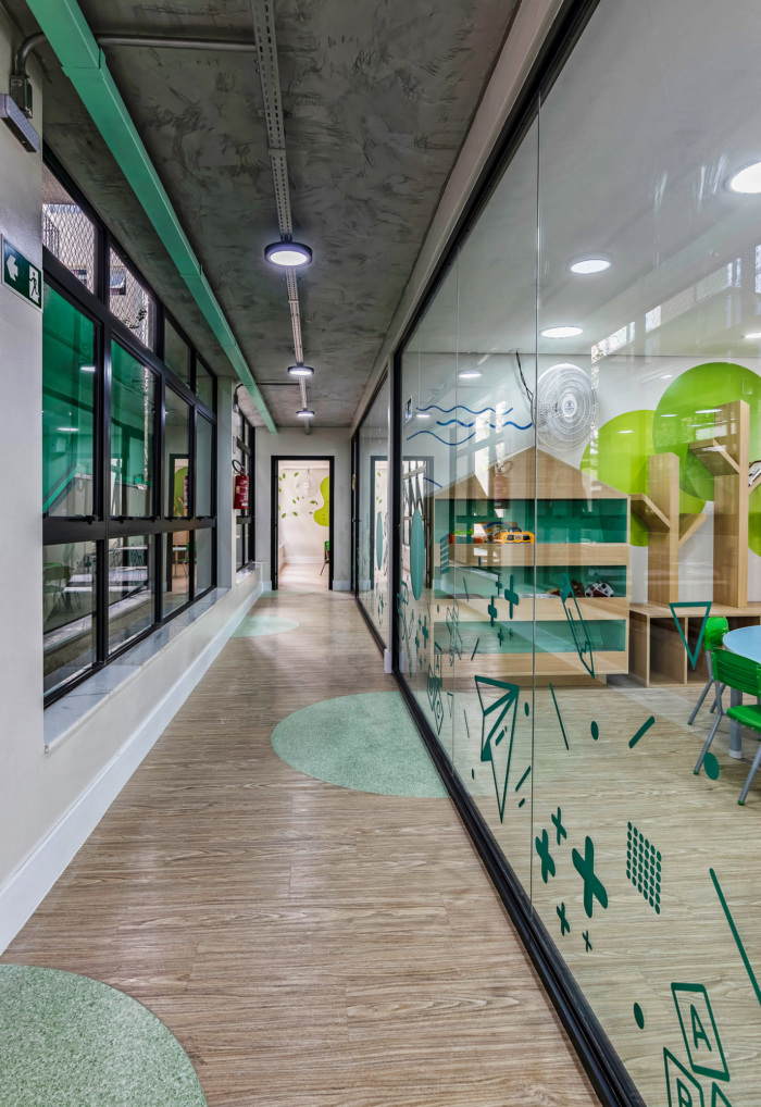
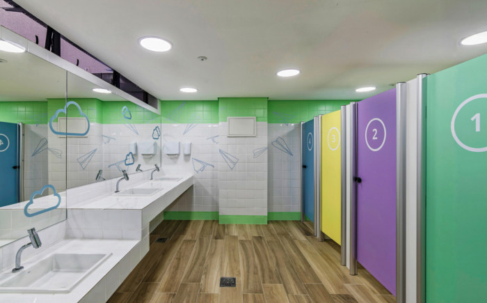
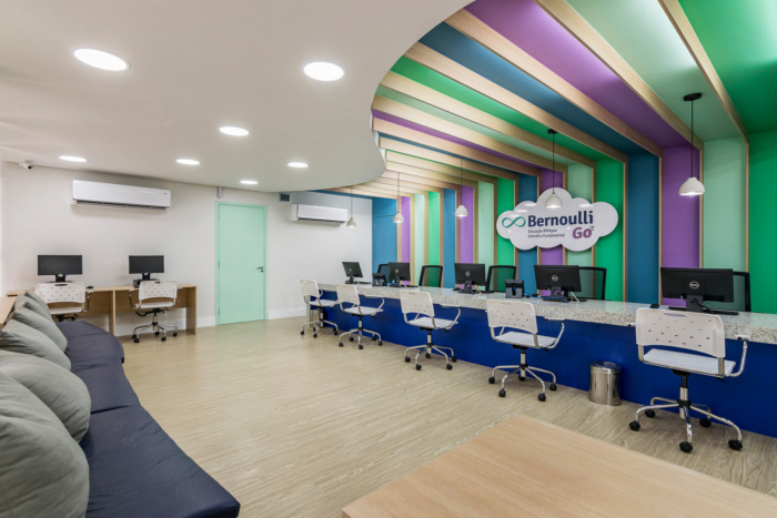
4. Places near the front-end and back-end of the building had a problem due to the excessive amount of natural lighting without any cover, causing problems for classrooms in these areas.To solve these problems, the building now has big openings that lead to both atriums, making use natural lighting, directly or indirectly, in every room of the building. This solution by itself gave a sensation of a higher celling-height, but the use of brighter colors in the corridors and classrooms highlighted the playful elements, giving a feeling of a broad space.
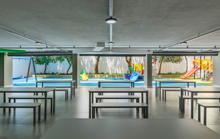
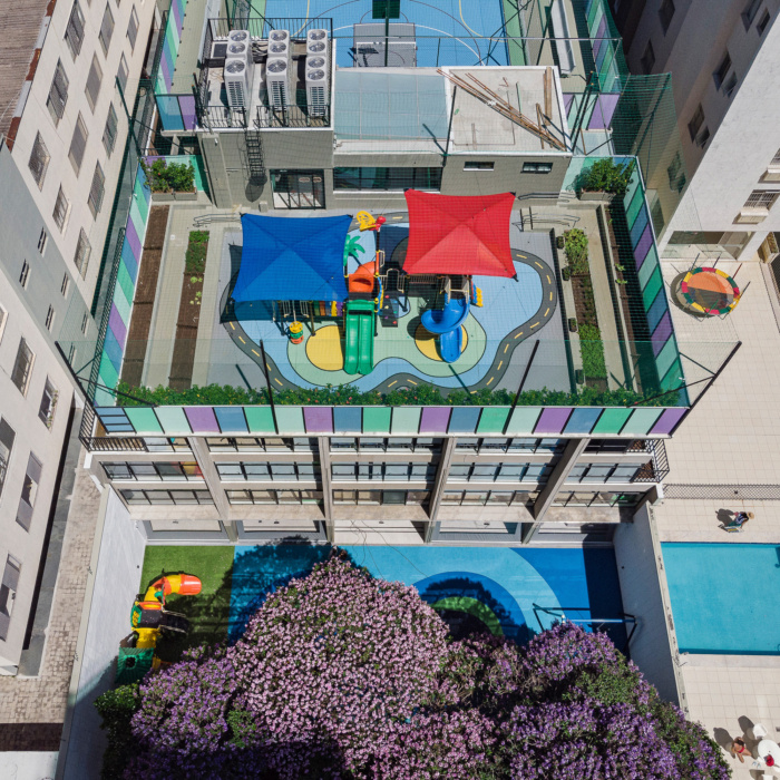
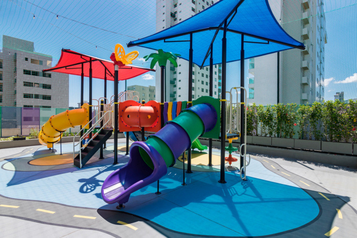
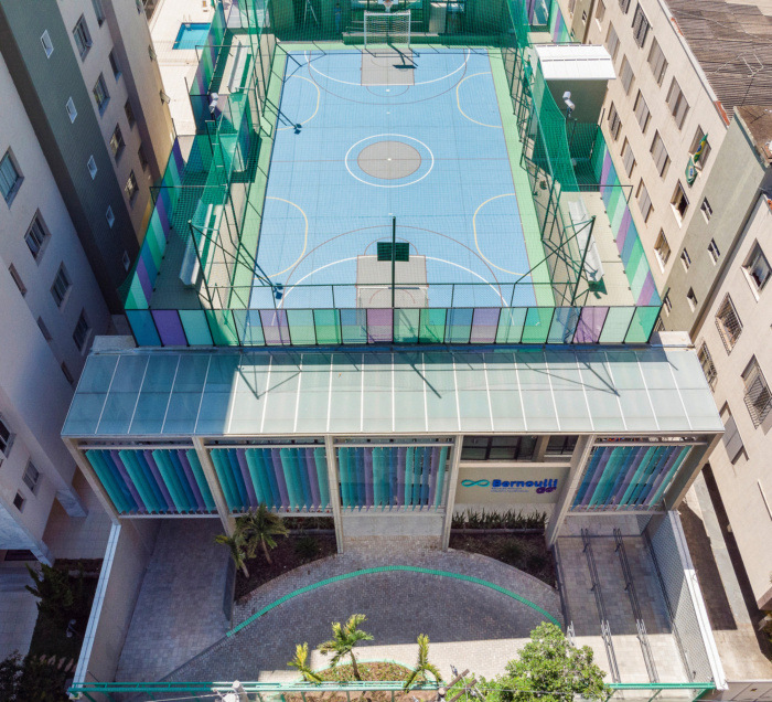
The sports court was built in the terrace of the building, creating an additional structure to fit the court and an external playground. The extra space gave the children a great open-air space to play during the class breaks.
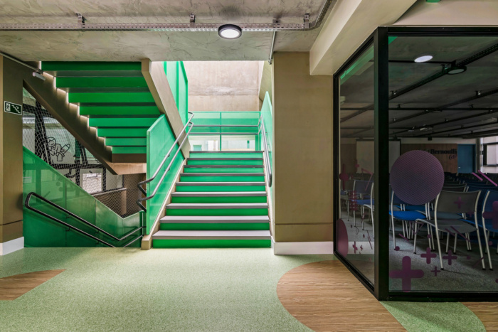
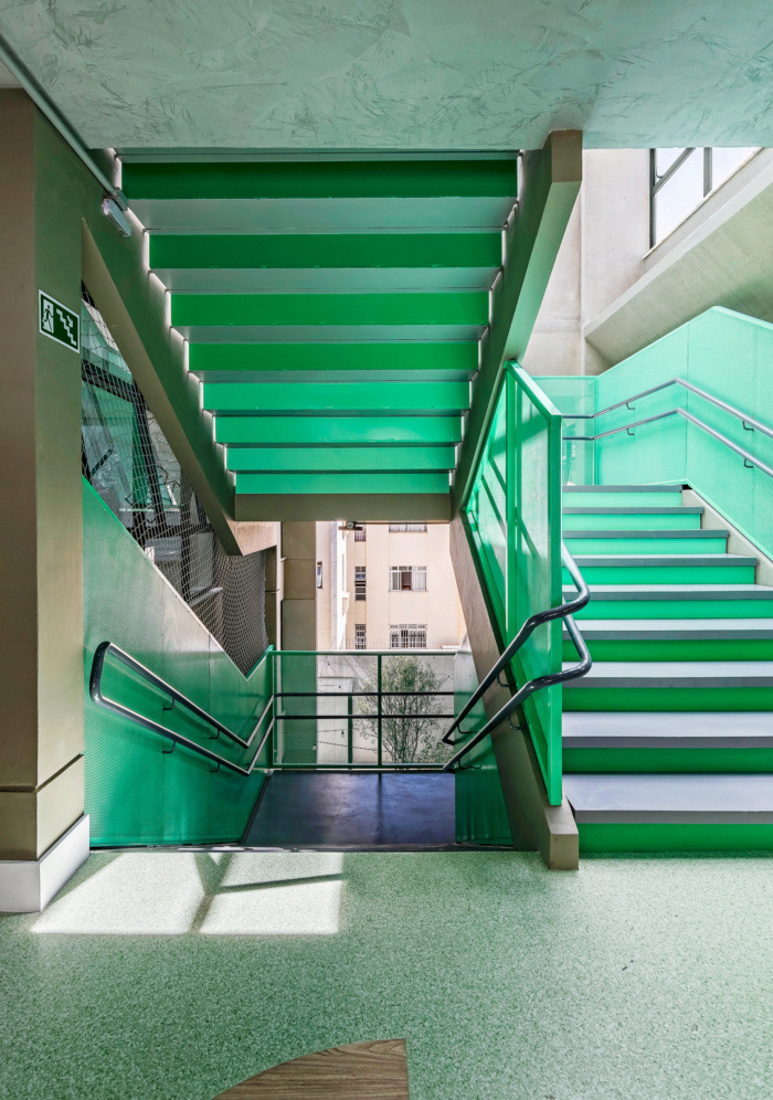
The existing vertical circulation of the building was kept, while an elevator box was built in one of the atriums. With this, different circulations were formed in the building, allowing the students to perceive different paths inside the school. This also divides the flow of students in the peak-times.
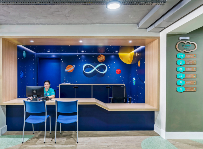
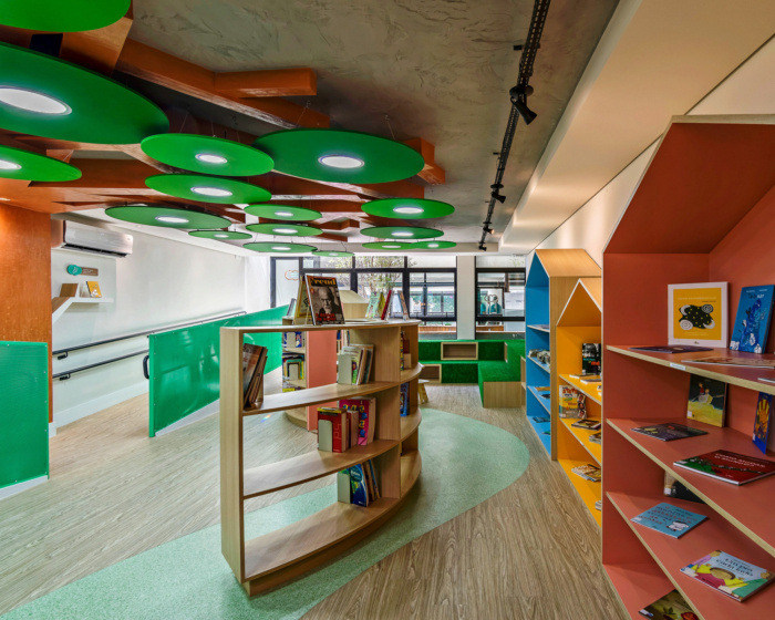
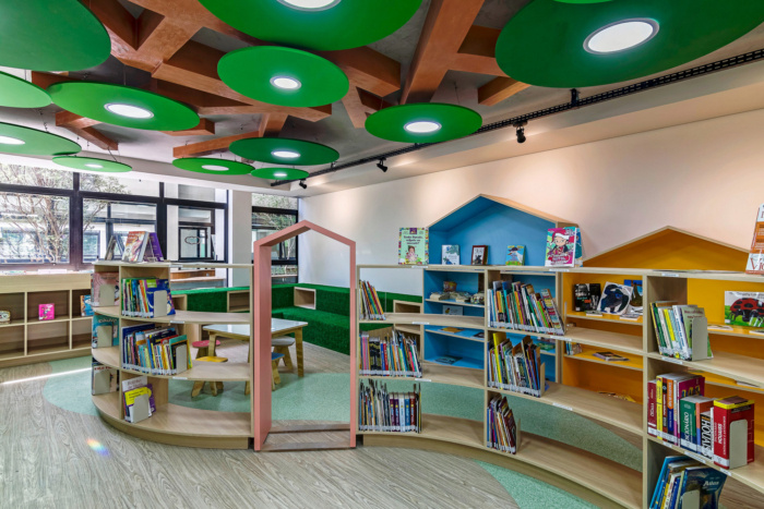
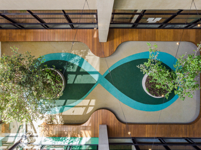
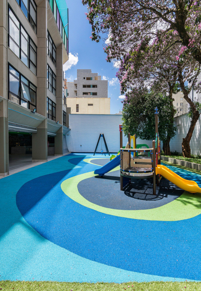
The project took a better use of the natural lighting by making the atriums useful by becoming open-air spaces to the school activities. Both atriums have access through the library, working as an extension of it. A curious detail of the project is that the external areas have the drawing of a Lemniscate in the floor, representing the symbol of the school. The drawings can be seen through the aerial photos taken.
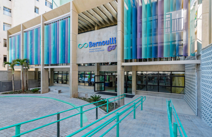
The building’s façade had a high solar incidence and to solve this problem, Brise Soleils with the school colors were installed in the existent concrete structure. The brises are used to filter the sunlight, improving the quality of the natural light in the classrooms facing the façade. The entrance of the building was fully renovated, considering the entrance and exit of the vehicles and pedestrians during the peak-times of the school: students’ arrival and exiting traffic.
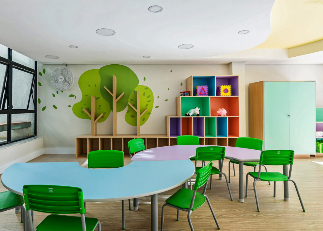
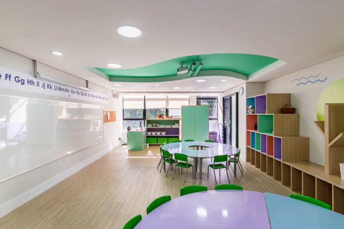
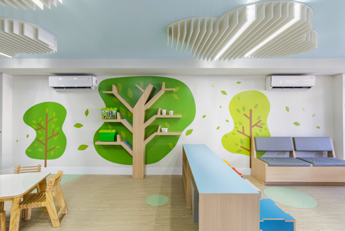
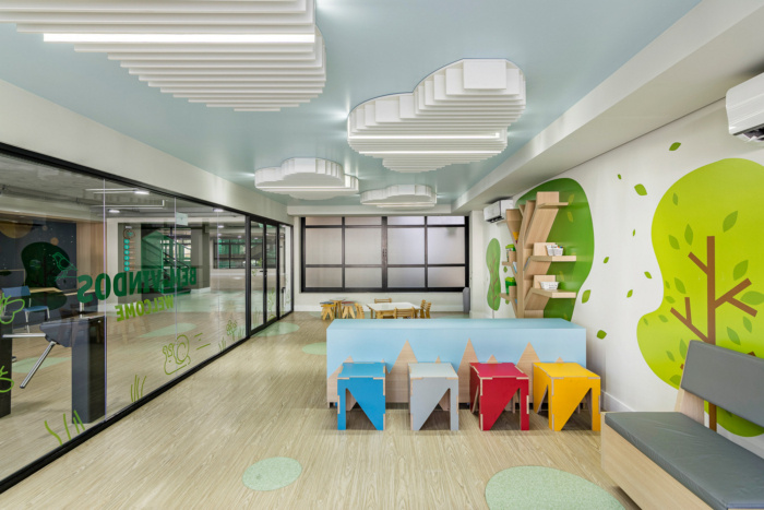
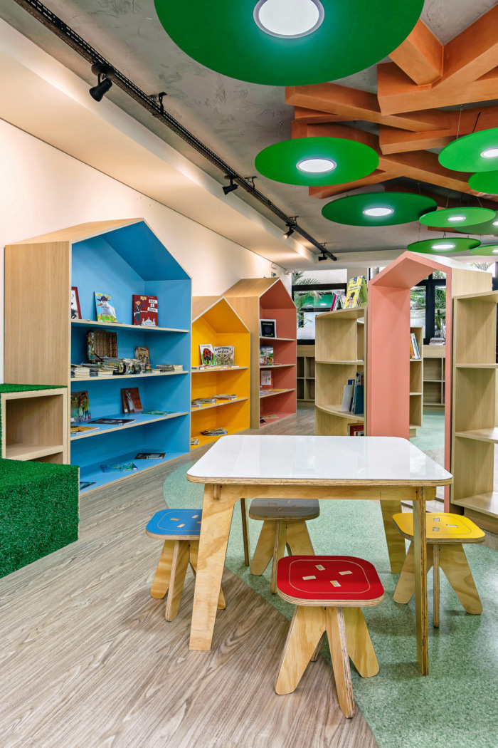
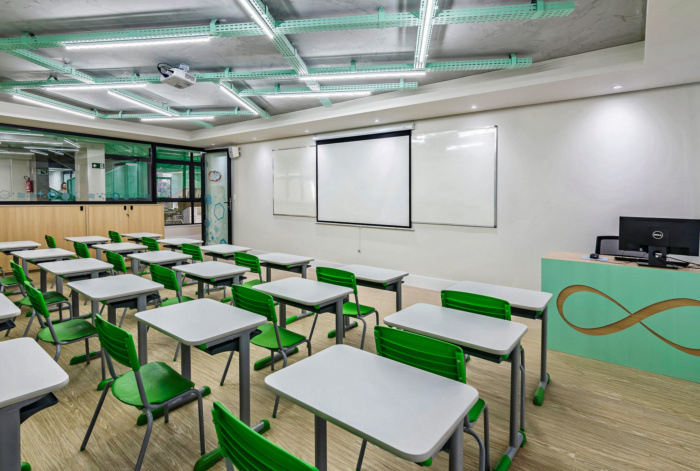
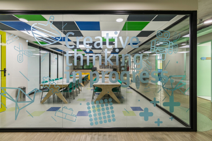
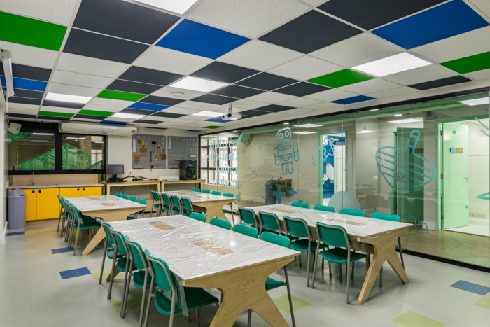
The entire school’s furniture project was developed by Studio dLux and produced by makers located near the school, through digital fabrication. This method also allowed us to use shapes and colors harmonizing with the school’s pedagogical program.
Architect: Studio dLux
Photography: Ivan Araújo





Now editing content for LinkedIn.